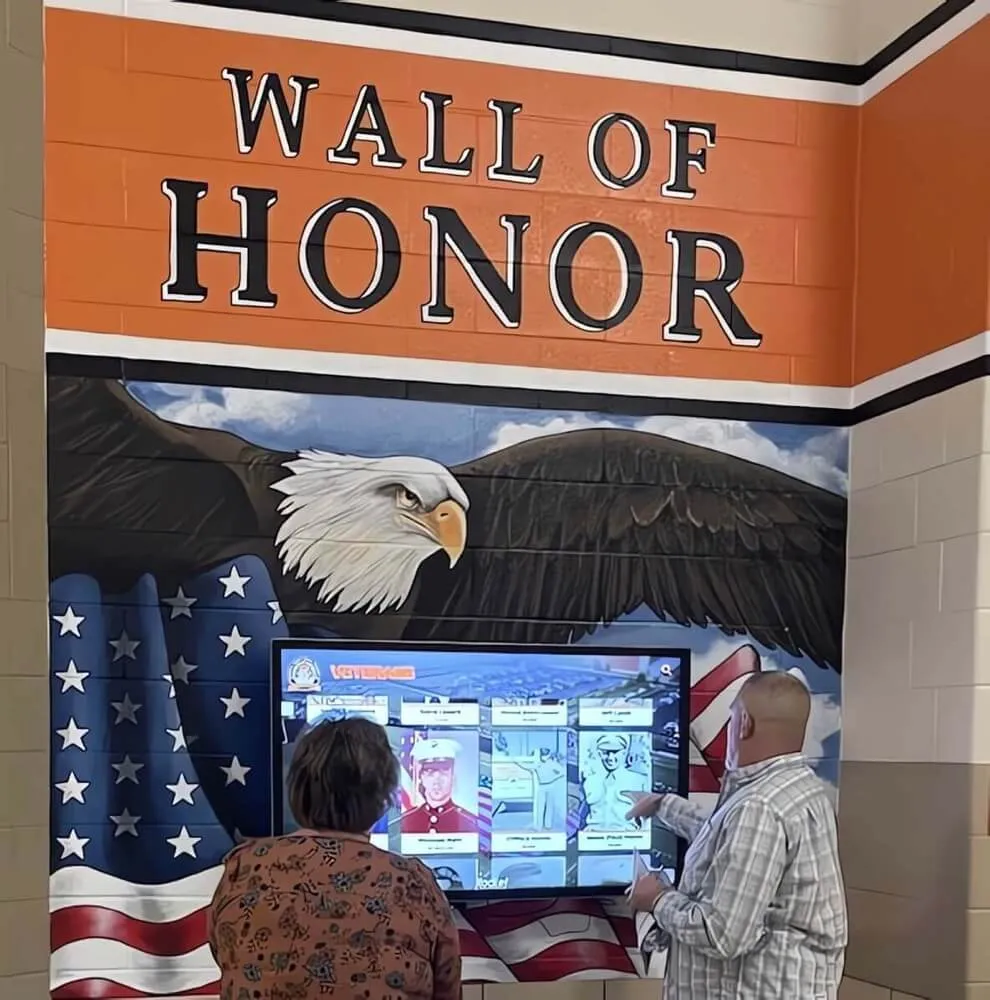
Designing an effective digital hall of fame touchscreen display layout requires more than simply digitizing traditional plaques or transferring content from physical trophy cases to screens. The most successful interactive recognition displays leverage strategic design principles that honor achievements while creating engaging exploration experiences that visitors actively choose to explore rather than passively glance at while passing through hallways.
Organizations implementing digital halls of fame report that thoughtful layout design directly impacts engagement metrics—well-designed interfaces generate 5-7 times more interaction than poorly organized systems, with visitors spending 6-10 minutes exploring content compared to mere seconds with confusing interfaces. These engagement differences translate to meaningful outcomes including stronger community pride, enhanced donor stewardship, more effective recruitment and admissions showcases, and measurably better return on technology investments.
This comprehensive guide explores evidence-based strategies for designing stunning digital hall of fame touchscreen display layouts that balance aesthetic beauty with functional usability. From understanding fundamental design principles through implementing visual hierarchies, creating intuitive navigation systems, optimizing multimedia integration, and continuously refining experiences based on user behavior, these approaches ensure your recognition displays engage audiences effectively while appropriately celebrating every achievement.
Effective touchscreen display layout design centers on understanding your audience’s needs, organizing content logically for exploration, creating visual systems that guide attention appropriately, and testing designs with real users before full deployment. Whether designing new installations or improving existing digital recognition systems, systematic design approaches transform technology investments into compelling experiences that honor achievement while building pride and connection within schools, universities, organizations, and institutions.

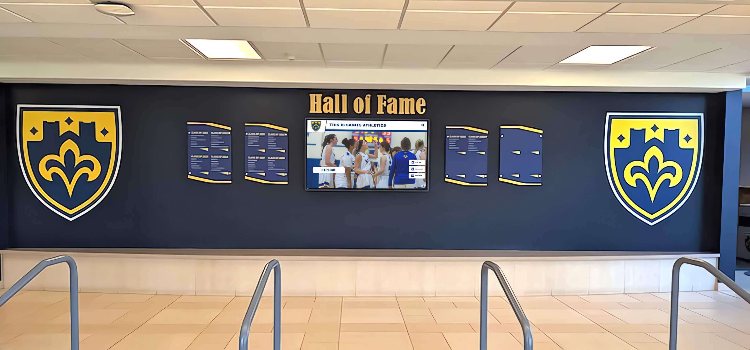
Well-designed touchscreen layouts create intuitive experiences that encourage exploration and engagement
Understanding Digital Hall of Fame Layout Design Fundamentals
Before diving into specific design decisions, understanding foundational principles that separate effective touchscreen layouts from confusing interfaces helps frame all subsequent choices.
How Digital Differs from Traditional Recognition Design
Physical plaques, trophy cases, and vinyl boards impose constraints that shape traditional recognition design. Digital touchscreens eliminate many limitations while introducing new considerations requiring different design approaches.
Unlimited Space Creates Organization Challenges
Traditional displays physically limit content—when wall space fills, recognition capacity ends. Digital platforms accommodate unlimited individuals, teams, achievements, and historical periods without consuming additional physical space. This unlimited capacity shifts design challenges from “what fits” to “how do we organize comprehensively so visitors can discover relevant content efficiently.”
Poor organization renders unlimited content useless because visitors cannot locate specific information or discover interesting achievements. Effective layout design transforms vast content libraries into navigable, explorable systems where every achievement remains accessible while popular content receives appropriate prominence.
Sequential vs. Simultaneous Information Presentation
Traditional displays present all content simultaneously—every plaque visible at once, every trophy case item viewable together. Digital layouts present content sequentially through screens and navigation. Visitors see limited information at any moment, navigating through designed pathways to explore additional content.
This fundamental shift requires careful information architecture determining what appears on home screens versus detail pages, which navigation paths visitors can follow, and how to balance comprehensive coverage with focused presentation preventing overwhelming cognitive load.
Interactive Engagement vs. Passive Viewing
Static displays require no decisions from viewers—information simply exists to be viewed or ignored. Touchscreen interfaces require continuous user decisions including what to touch first, which navigation options to select, what content to explore versus skip, and when to exit versus continue engagement.
Design must guide these decisions through clear visual hierarchies, intuitive interaction patterns, compelling calls-to-action, and forgiving navigation enabling recovery from wrong turns. Effective layouts make correct choices obvious while supporting exploration without penalty for curiosity.
Learn about comprehensive approaches to digital hall of fame touchscreen systems that demonstrate these fundamental principles in practice.
Essential Layout Design Principles for Recognition Displays
Specific principles proven effective across diverse touchscreen contexts provide foundations for recognition-specific design decisions.
Visual Hierarchy and Attention Guidance
Effective layouts establish clear visual hierarchies that direct attention appropriately through size relationships indicating importance, color contrast highlighting key elements, spatial positioning placing critical content prominently, typography differentiation separating headings from body text, and white space framing important elements distinctly.
Visual hierarchy ensures visitors immediately understand where to begin interaction, what content merits attention, what actions they can take, and how information relates hierarchically. Without clear hierarchy, layouts feel cluttered and overwhelming regardless of individual element quality.
Consistency and Pattern Recognition
Human brains excel at recognizing patterns and leveraging learned behaviors in new contexts. Consistent design accelerates understanding through repeated interaction patterns that become automatic, predictable navigation reducing cognitive load, consistent visual styling building professional appearance, and standardized content structures enabling pattern recognition.
Consistent interaction patterns enable intuitive navigation without instruction
Once visitors learn that profiles appear by touching photos, that back arrows return to previous screens, or that specific icons indicate video content, consistency ensures these patterns work identically throughout interfaces. Breaking patterns confuses users even when individual instances might offer slight advantages.
Accessibility and Inclusive Design
Recognition displays serve diverse audiences including children through senior adults, users with varied physical abilities, visitors with different technical comfort levels, and individuals with visual or motor impairments. Accessible design ensures usability for all audiences through touch targets sized appropriately for comfortable interaction, text legibility at viewing distances typical for displays, color combinations providing sufficient contrast, navigation operable without fine motor control, and alternative access methods when appropriate.
Accessible design benefits everyone, not only users with disabilities—larger touch targets reduce errors for all users, clear text improves readability universally, and intuitive navigation serves both tech-savvy and novice visitors effectively.
Recognition-Appropriate Tone and Aesthetics
While general touchscreen design principles apply, recognition displays require specific tonal qualities distinguishing them from commercial kiosks or entertainment applications including dignified aesthetics honoring achievement appropriately, professional presentation maintaining credibility, inclusive design celebrating diverse accomplishments equally, and timeless styling avoiding trendy elements that quickly date installations.
Recognition layouts should feel celebratory without being frivolous, professional without being sterile, engaging without being distracting, and modern without being unnecessarily avant-garde. This balance ensures displays appropriately honor achievement while remaining approachable and engaging for broad audiences.
Strategic Information Architecture: Organizing Content for Discovery
Before designing visual layouts, establishing clear information architecture determines how content structures logically, how visitors navigate between sections, and what organizational schemes enable effective exploration.
Understanding Your Content Categories and Relationships
Effective architecture begins with comprehensive content inventory and relationship mapping.
Content Type Identification
Catalog all content your recognition display will showcase including individual profiles (athletes, students, donors, alumni, members), team or group achievements, historical timelines and milestones, statistical records and rankings, multimedia content (photos, videos, documents), and contextual information (program descriptions, traditions, facility history).
Different content types require different presentation approaches and navigation structures. Mixed content types demand thoughtful integration ensuring each type receives appropriate treatment within cohesive overall systems.
Relationship Mapping
Identify meaningful connections between content elements that should inform navigation options including individuals connected through teams or groups, chronological relationships grouping eras or years, program affiliations linking achievements to specific sports or activities, achievement type connections (championships, records, awards), and geographic or demographic relationships when relevant.
These relationships suggest navigation pathways and linking strategies that enable visitors to explore related content naturally. An athlete profile might link to their championship teams, other individuals from the same year, or additional record holders in similar events.
Clear content organization enables effective navigation across comprehensive historical collections
Priority and Prominence Decisions
Not all content merits equal visibility. Strategic prominence decisions include featured content receiving home screen placement, recent achievements highlighted before historical content, record holders or exceptional accomplishments elevated above routine recognition, and timely seasonal content surfaced appropriately.
These priority decisions shape layout design by determining what appears on high-level screens versus deeper navigation levels. Clear priorities prevent treating all content identically, which ironically diminishes recognition impact by overwhelming visitors with undifferentiated information.
Explore approaches to digital storytelling for athletic programs that demonstrate effective content organization and relationship mapping.
Navigation Structure Options for Hall of Fame Displays
Several common navigation structures serve recognition content effectively, often combined within single implementations.
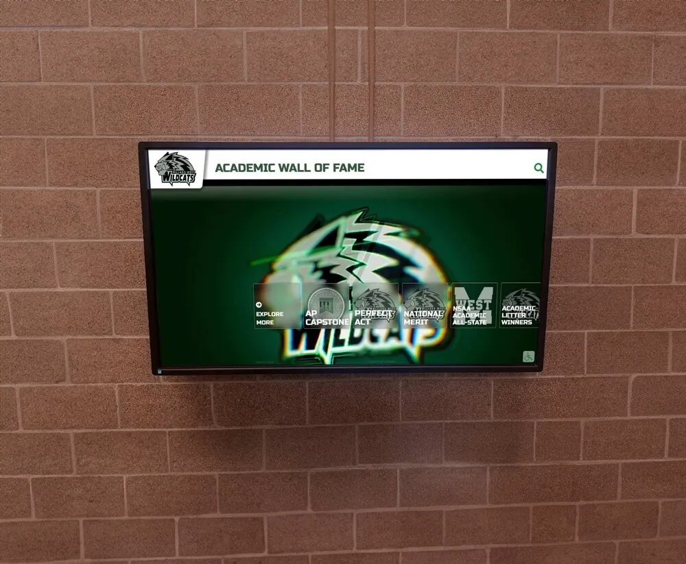
Categorical Navigation by Achievement Type
Organizing content by recognition category provides intuitive navigation matching how users think about achievement including athletics (by sport, season, or achievement type), academics (by subject area, award type, or level), arts and activities (by program or discipline), service and leadership, and historical periods or eras.
Categorical navigation works particularly well when organizations have diverse recognition across multiple distinct programs. Visitors interested specifically in athletic achievements can navigate directly to sports content, while those exploring academic recognition find relevant content efficiently without filtering through unrelated achievements.
Chronological Timeline Navigation
Time-based organization presents achievements sequentially by year, decade, or era. Timeline navigation serves historical preservation goals particularly well by enabling visitors to explore specific periods comprehensively, comparing achievements across years, discovering institutional evolution, and identifying multi-year patterns or trends.
Timeline layouts work effectively when organizations emphasize historical depth and institutional legacy. Schools celebrating centennials or organizations honoring founder generations benefit from chronological approaches that contextualize current success within historical tradition.
Alphabetical Directory Navigation
Simple alphabetical organization by individual name provides fastest access when visitors know specifically whom they’re seeking. Directory approaches excel for member recognition, alumni halls of fame, donor acknowledgment, and any application where direct lookup outweighs exploratory discovery.
Alphabetical navigation often complements other organizational schemes rather than serving as sole structure. Home screens might feature categorical or timeline navigation while search results or directory sections use alphabetical listing for efficient lookup.
Search-First Flexible Navigation
Rather than prescribing specific navigation pathways, search-first designs provide robust search functionality supplemented by flexible browsing options. Visitors can search by name, keyword, year, achievement type, or other criteria, with results dynamically organized and filtered.
Search-first approaches work well for comprehensive systems with thousands of profiles where no single navigation structure serves all use cases equally. Effective search requires careful tagging, categorization, and metadata management ensuring content surfaces appropriately for varied queries.
Learn about comprehensive interactive touchscreen displays for school recognition demonstrating diverse navigation approaches.
Screen Flow and User Journey Design
Beyond overall architecture, designing specific screen sequences determines how visitors progress through content exploration.
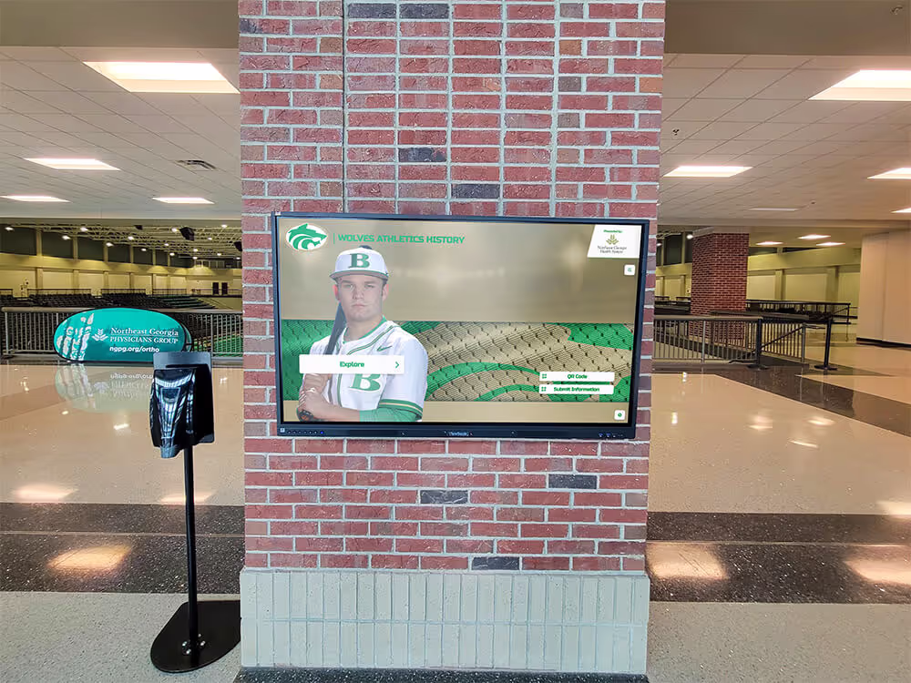
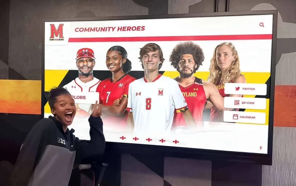
Home Screen Strategy
Initial screens establish first impressions and guide visitors into content. Effective home screens accomplish multiple objectives including capturing attention with compelling visuals or featured content, communicating purpose and available content clearly, providing multiple entry points serving diverse visitor interests, and establishing interaction patterns visitors will encounter throughout.
Home screens balance competing needs—providing enough information to orient visitors without overwhelming, featuring compelling content without favoring certain categories inappropriately, and maintaining visual interest without creating chaotic impressions.
Progressive Disclosure and Information Depth
Effective layouts reveal information progressively through hierarchical depth including overview screens presenting summaries and key information, detail screens providing comprehensive content for those interested, and linked resources connecting to related content or external resources.
Progressive disclosure prevents overwhelming visitors while enabling interested users to access comprehensive information. An initial team listing might show photos, years, and brief achievements, with touch interaction revealing complete rosters, season statistics, championship details, and related historical context.
Return Navigation and Wayfinding
Visitors exploring deep into content hierarchies need clear paths returning to starting points including consistent back navigation returning to previous screens, home button access from any screen, breadcrumb trails showing current location within hierarchy, and exit prompts when appropriate for lengthy sessions.
Effective wayfinding prevents visitors from feeling lost or trapped. Even when deeply engaged with content, users should understand their current location and have obvious options for navigation or exit.
Visual Design: Creating Compelling Recognition Layouts
With information architecture established, visual design translates structure into beautiful, engaging layouts that honor achievement while encouraging exploration.
Color, Typography, and Branding Integration
Visual styling creates emotional tone while supporting usability and reinforcing organizational identity.
Color Psychology and Recognition-Appropriate Palettes
Color choices significantly impact perception and emotional response. Recognition displays benefit from palettes conveying appropriate qualities including trust and dignity through blues and subdued tones, celebration and achievement through gold and warm accent colors, institutional identity through organizational brand colors, and visual hierarchy through purposeful contrast and emphasis.
Avoid overly bright, commercial color schemes that feel inappropriate for honoring achievement. Similarly, overly muted palettes may fail to convey celebration and pride. Strategic color use balances dignity with engagement, professionalism with warmth.
Typography Hierarchy and Readability
Text legibility proves critical for touchscreen displays viewed from various distances and angles. Effective typography includes appropriate sizing for viewing distances typical at your installations, clear hierarchy differentiating headings from body text, highly legible typefaces avoiding decorative fonts for body content, sufficient contrast between text and backgrounds, and consistent styling establishing recognizable patterns.
Consider that touchscreen displays often position 4-6 feet from viewers—text sizing appropriate for desktop screens may prove too small for comfortable reading at display distances. Test typography at actual installation distances and viewing angles during design.
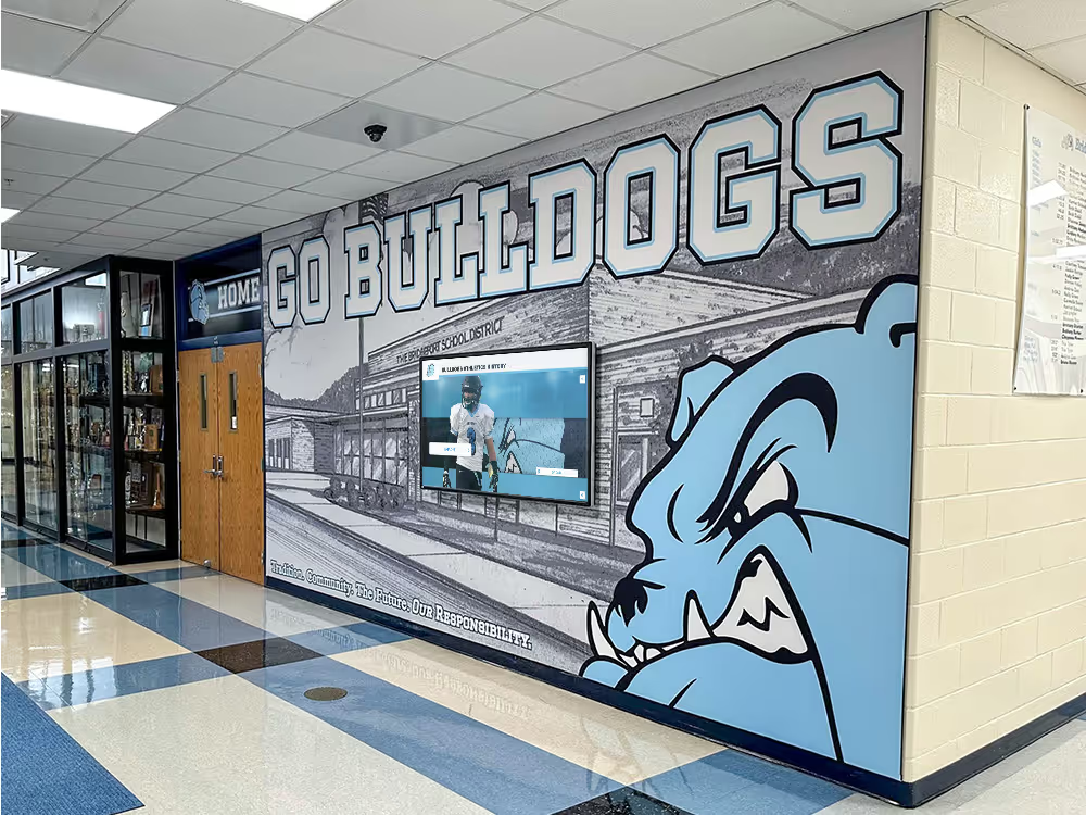
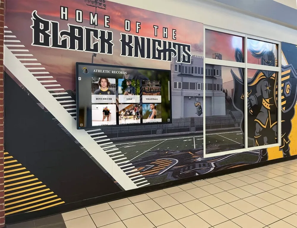
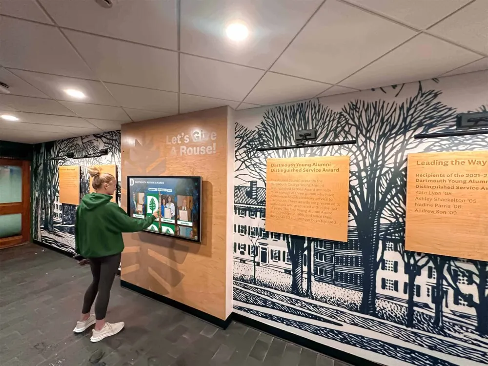
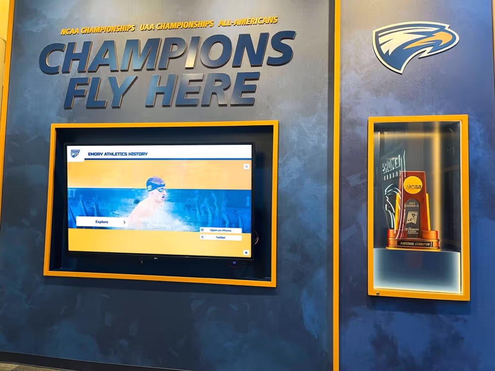
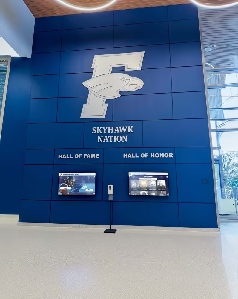
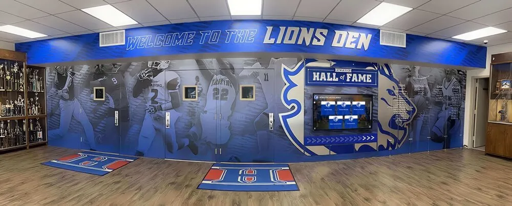
Brand-consistent visual design integrates digital displays naturally with existing recognition environments
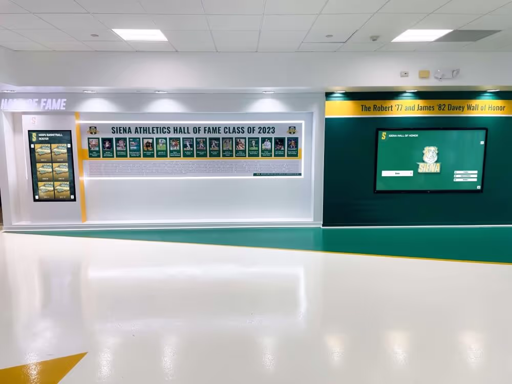
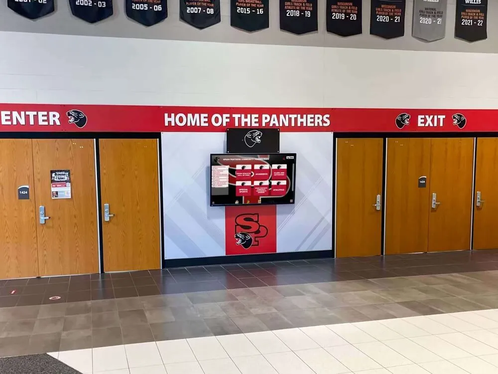
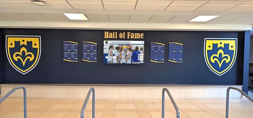
Organizational Branding and Visual Identity Integration
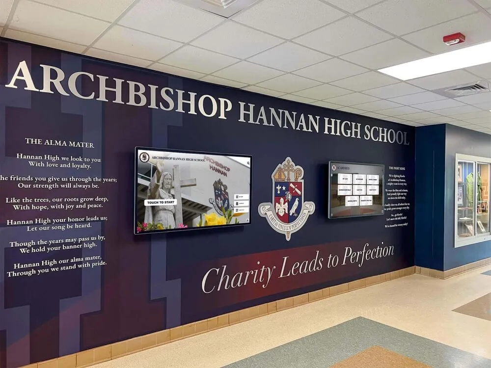
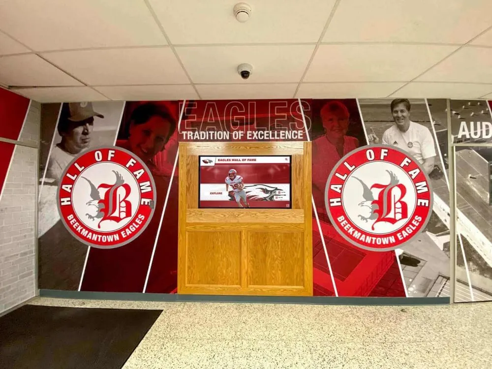
Recognition displays should reflect organizational identity through color schemes matching institutional branding, typography consistent with other organizational communications, logo integration at appropriate scale and placement, design aesthetics complementing architectural context, and overall styling reinforcing rather than conflicting with institutional character.
Consistent branding strengthens recognition impact by reinforcing institutional pride and identity. Visitors should immediately recognize displays as authentic representations of organizations they honor.
White Space and Visual Breathing Room
Novice designers often attempt maximizing screen space utilization by filling every pixel with content. Professional layouts leverage generous white space providing visual rest, focusing attention on key elements, preventing cluttered overwhelming appearance, and creating sophisticated polished aesthetics.
White space is design feature, not wasted space. Strategic emptiness makes important content more prominent and layouts more visually appealing than dense information-packed alternatives.
Layout Grids and Content Organization Patterns
Systematic grid systems create visual order while supporting consistency across varied content types.
Grid-Based Layout Systems
Professional layouts typically employ underlying grid structures including column-based grids organizing content horizontally, modular grids defining vertical and horizontal units, hierarchical grids supporting varied content importance, and responsive grids adapting to different screen sizes and orientations.
Grid systems prevent arbitrary positioning while supporting varied content needs within consistent frameworks. Even when individual screens appear quite different, underlying grids create subtle visual consistency reinforcing professional polish.
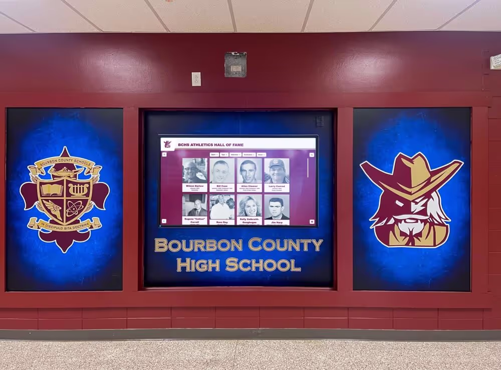
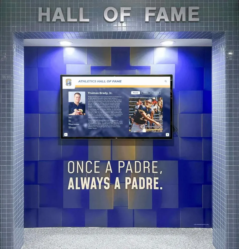
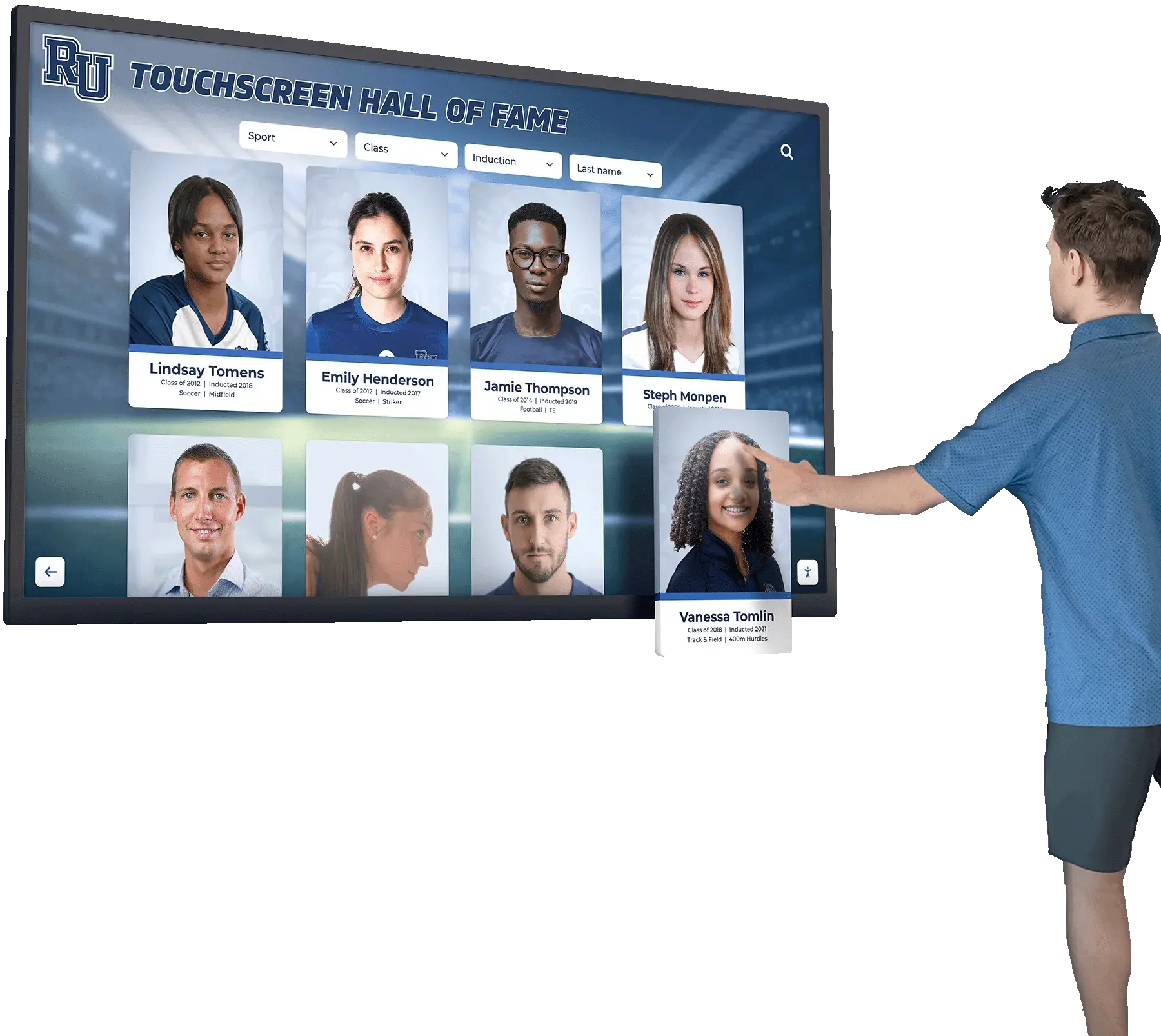
Content Card Patterns for Profile Presentation
Recognition content frequently uses card-based patterns presenting individual profiles through consistent modules including profile photos prominently featured, names and key identifiers clearly visible, brief descriptive content providing context, visual treatment distinguishing cards from backgrounds, and obvious touch affordances indicating interactivity.
Card patterns work particularly well for browsing interfaces where visitors scan multiple options before selecting specific profiles for detailed exploration. Cards provide sufficient information for selection decisions while maintaining scannable density enabling efficient browsing.
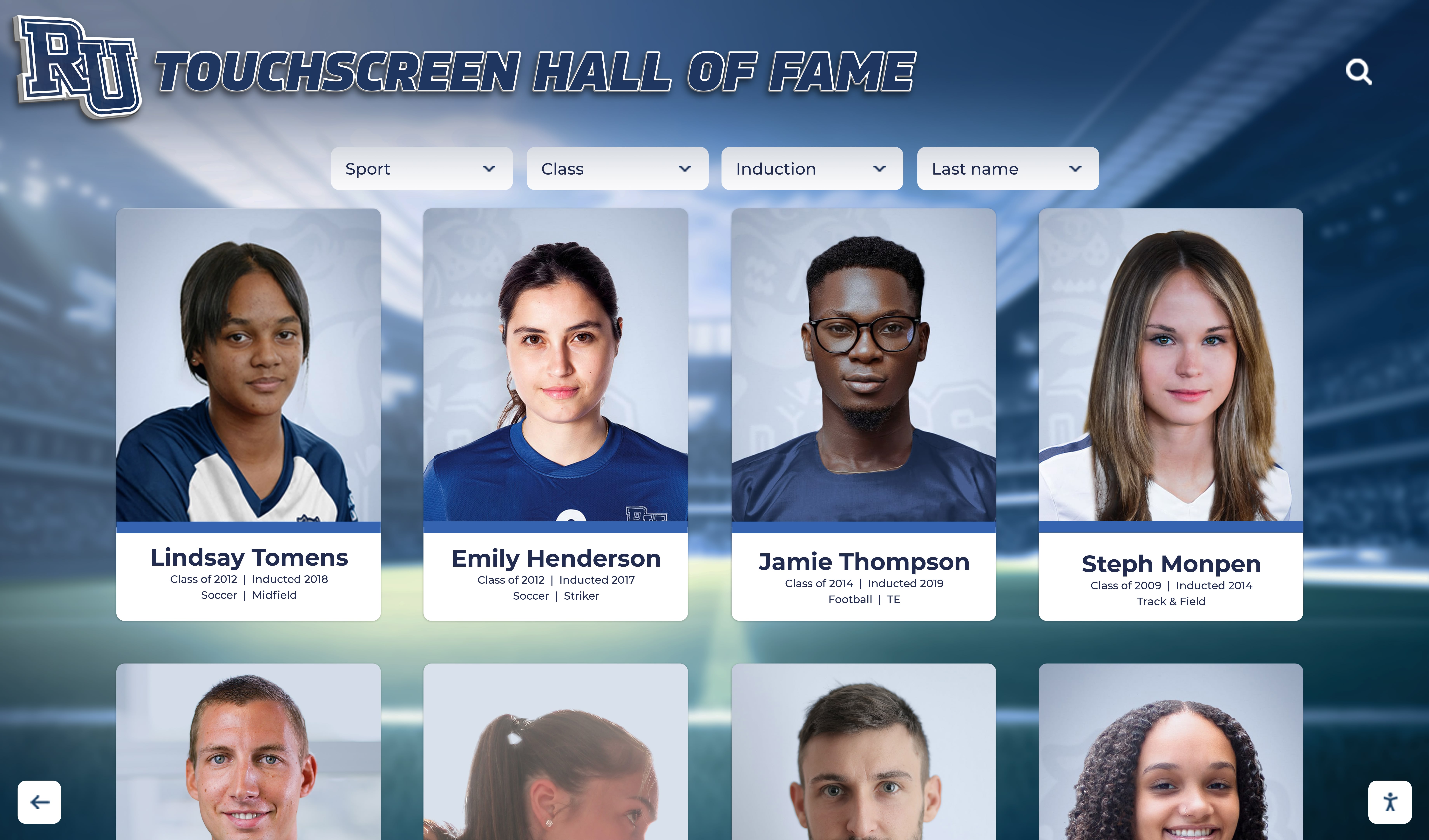
Card-based layouts enable efficient browsing while maintaining visual clarity
List vs. Gallery vs. Timeline Visualization
Different content types and use cases favor different presentation patterns. Lists work best for directory-style browsing with emphasis on names and key metadata. Galleries emphasize visual content through prominent imagery in grid arrangements. Timelines show chronological progression through horizontal or vertical time-based layouts.
Many effective implementations combine multiple patterns for different content sections—gallery views for featured achievements, list views for comprehensive directories, timeline views for historical content.
Detail Screen Layout Strategies
When visitors select specific individuals or achievements for detailed exploration, dedicated detail screens provide comprehensive information through clear hierarchical content organization, prominent heroic imagery, logical reading flow from overview to specifics, related content suggestions encouraging further exploration, and obvious navigation back to browsing.
Detail screens balance comprehensiveness with scannability—visitors should quickly grasp key information while having access to complete content for those interested in depth.
Learn about effective digital hall of fame software approaches that demonstrate these layout patterns.
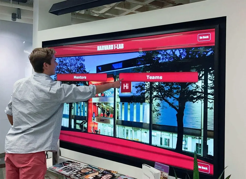
Interaction Design: Making Touchscreens Intuitive and Engaging
Visual layouts provide structure, but interaction design determines how visitors actually engage with recognition content through touch.
Touch Targets, Gestures, and Feedback
Physical interaction through touch introduces usability considerations beyond visual design.
Appropriate Touch Target Sizing
Fingers are substantially less precise than mouse cursors. Touch targets must accommodate this reality through minimum touch target sizes of 44x44 pixels (approximately 9-10mm at typical display sizes), spacing between touch targets preventing accidental activation, larger targets for primary actions versus secondary functions, and sufficient padding around interactive elements.
Undersized touch targets create frustration when visitors struggle to activate intended functions or accidentally trigger wrong actions. Generous touch target sizing improves usability for all visitors while proving essential for users with motor control challenges.
Gesture Support and Conventions
Modern touchscreens support various gestures beyond simple tapping. Effective recognition interfaces leverage appropriate gestures including tap for primary selection and activation, swipe for navigating between items or screens, pinch-to-zoom for detailed image inspection, long-press for alternate actions or context when appropriate, and scroll for content extending beyond single screens.
Follow established gesture conventions from smartphone and tablet interfaces—unconventional gestures require explanation and learning curves that increase friction and reduce engagement.
Immediate Visual and Haptic Feedback
Visitors need instant confirmation that systems registered their touches through visual state changes indicating selection, subtle animations acknowledging interaction, optional audio feedback confirming actions, haptic feedback on supported hardware, and clear visual differentiation between inactive, hover, and active states.
Delayed or missing feedback creates uncertainty about whether touches registered, leading to repeated attempts, frustration, and abandonment. Instant unambiguous feedback maintains users’ sense of control and direct manipulation that makes touchscreens compelling.
Error Prevention and Graceful Recovery
Good interaction design prevents errors while enabling easy recovery when mistakes occur including confirmation prompts for potentially destructive actions, forgiving undo functionality when appropriate, clear error messages when problems occur, consistent back navigation enabling retreat from wrong turns, and automatic timeout returning to safe home states.
Recognition displays rarely involve destructive actions requiring confirmation, but navigation errors—selecting wrong individuals, entering unwanted sections—should enable instant correction without penalty or lost context.
Animation, Transitions, and Visual Continuity
Motion design creates polish while supporting usability through visual continuity and spatial awareness.
Purposeful Animation Enhancing Understanding
Effective animations serve specific purposes beyond decoration including indicating relationship between screens through spatial transitions, providing feedback confirming user actions, directing attention to important changes or updates, and creating engaging polished experiences that feel responsive and alive.
Avoid gratuitous animation that increases cognitive load without providing value. Every animation should serve usability or engagement purpose beyond simply looking dynamic.
Transition Timing and Easing
Animation quality depends on appropriate timing and motion curves including duration short enough maintaining responsiveness (typically 200-400ms), easing curves creating natural acceleration and deceleration, consistency in timing across similar transitions, and interruption support when users interact during animations.
Overly slow animations feel sluggish and unresponsive. Excessively fast transitions appear jarring and disable spatial awareness. Optimal timing balances responsiveness with comprehensibility.
Loading States and Progress Indication
When content requires time to load—particularly video or high-resolution images—clear loading indication maintains engagement including progress indicators showing completion percentage, skeleton screens previewing content structure while loading, meaningful placeholder content avoiding blank screens, and entertaining loading messages or visuals when extended delays are unavoidable.
Blank screens or frozen interfaces during loading create impression of malfunction, causing visitors to repeatedly touch or abandon interaction. Clear loading feedback maintains confidence that systems are functioning appropriately.
![]()
Professional kiosks integrate hardware and software design for cohesive engaging experiences
Multimedia Integration: Enhancing Recognition Through Rich Content
Digital platforms enable multimedia storytelling impossible through traditional static recognition, but effective integration requires strategic design choices.
Photography Standards and Visual Content Strategy
High-quality imagery dramatically impacts engagement and recognition effectiveness.
Professional Photography vs. Archived Images
Recognition displays typically combine professional photography with historical archived images, each requiring different treatment. Contemporary professional photography should emphasize high resolution (minimum 1920x1080, preferably higher), proper lighting and exposure, consistent styling across sets, appropriate context and backgrounds, and professional editing and color correction.
Historical archived images may have quality limitations—lower resolution, faded colors, physical damage. Thoughtful restoration, appropriate context setting expectations, and design accommodating varied quality levels ensure historical content receives appropriate presentation despite technical limitations.
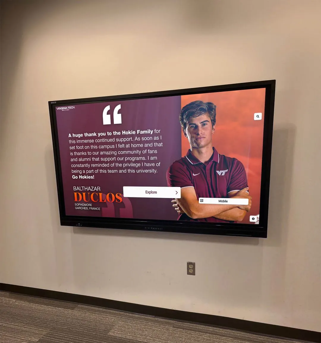
Portrait vs. Action Photography
Recognition profiles benefit from both portrait and action photography serving different purposes. Portrait photography provides clear identification, creates personal connection, maintains consistency across profiles, and enables efficient card-based layouts. Action photography demonstrates achievement contexts, creates visual interest and variety, tells achievement stories visually, and engages visitors emotionally.
Effective layouts incorporate both types—portrait photos for primary identification and browsing, action images for storytelling and detail screens.
Image Aspect Ratios and Cropping Strategies
Consistent aspect ratios create visual order in grid-based layouts, but historical content arrives in varied formats. Design must balance consistency with respect for original content through standardized aspect ratios for primary layouts, thoughtful cropping that preserves content integrity, alternative layout options accommodating varied formats, and full-resolution access for visitors wanting complete original images.
Avoid destructive cropping that eliminates important context or creates awkward compositions. When original images don’t fit predetermined aspect ratios, consider whether layout should adapt to content rather than forcing content into rigid templates.
Video Content Integration and Playback Design
Video brings recognition to life through highlight reels, ceremony documentation, and testimonial content.
Video Purpose and Length Considerations
Different video types serve different recognition purposes. Highlight reels showcase athletic or performance achievements through 30-90 second compilations. Ceremony documentation preserves award presentations and speeches through 2-5 minute segments. Testimonial content shares personal stories through 1-3 minute interviews. Decide appropriate video types for your recognition goals and design accordingly.
Avoid lengthy videos in public kiosk contexts where other visitors may be waiting—videos longer than 5 minutes should provide clear duration indication and easy exit options.
Playback Controls and User Agency
Visitors need control over video experiences including obvious play/pause controls, progress indication and seeking capability, volume control or optional audio, full-screen viewing options, easy exit without watching completely, and automatic return to previous context after viewing.
Forced autoplay video or playback without controls creates frustration and appears amateurish. Respect visitor agency by making video optional enhancement rather than mandatory interruption.
Thumbnail Design and Video Indication
Clear visual indication that content includes video prevents confusion and sets appropriate expectations through recognizable play button iconography, video duration indication, engaging thumbnail frame selection, and visual differentiation from static images.
Visitors should immediately recognize video content availability and understand what they’ll experience before initiating playback.
Explore comprehensive library touchscreen interactive display strategies that demonstrate effective multimedia integration.
Audio Considerations for Public Recognition Displays
Audio presents unique challenges in public recognition contexts requiring thoughtful design decisions.
When Audio Enhances vs. Distracts
Audio can enhance recognition through narration explaining achievements, ambient sound creating atmosphere, video soundtracks providing context, and audio testimonials sharing personal stories. However, public displays must consider ambient noise in hallways or lobbies making audio difficult to hear, privacy concerns in quiet spaces, distraction to nearby activities or conversations, and accessibility requirements providing alternative content access.
Many effective recognition displays operate silently or with optional audio through headphone jacks, relying on visual content that works in sound-optional contexts.
Caption and Transcript Requirements
When audio content carries important information, accessible design requires text alternatives including complete captions for video content, transcripts for audio-only content, visual indicators showing caption availability, and accessible caption controls enabling activation.
Captions serve not only hearing-impaired users but all visitors in noisy environments or situations where audio isn’t practical.
Mobile and Web Extension Design
While this guide focuses primarily on physical touchscreen displays, many recognition systems include web-based extensions that require coordinated design.
Responsive Design for Multi-Device Access
Recognition content accessed through web browsers requires adaptive layouts serving varied screen sizes.
Adapting Touchscreen Layouts for Desktop and Mobile
Physical kiosk designs optimized for 55" touchscreens don’t translate directly to laptop screens or smartphones. Responsive design adapts layouts appropriately through flexible grids adjusting to screen width, content prioritization showing most important elements on small screens, touch target sizing appropriate for device types, navigation patterns matching device conventions, and performance optimization for varied network conditions.
Maintain brand consistency and content accuracy across devices while adapting presentation to platform-appropriate patterns.
Cross-Platform Design Systems
Effective multi-platform recognition uses design systems establishing consistent visual language across touchpoints including shared color palettes and typography, common iconography and visual elements, consistent content structure and hierarchy, and unified tone and messaging while adapting layouts, interactions, and navigation to platform-specific best practices.
Design systems enable consistency without requiring identical implementation across dramatically different contexts.
QR Code Integration and Physical-Digital Connections
Physical and digital recognition can connect through QR codes and other linking mechanisms.
QR Code Best Practices for Recognition Displays
QR codes enable smartphone users to access recognition content directly through placement at entry points and on physical displays, linking to specific individuals or achievements rather than generic homepages, mobile-optimized destinations loading quickly on smartphones, and clear instructions for visitors unfamiliar with QR codes.
QR codes complement rather than replace touchscreen displays—they enable personal device access without requiring all recognition to happen through mobile interfaces.
Sharing and Social Media Integration
Digital recognition naturally extends through social sharing including share buttons enabling social media posting, shortened URLs for easy sharing, visual cards optimized for social preview, and privacy controls allowing opt-out from sharing when appropriate.
Social sharing amplifies recognition reach while creating authentic testimonials as community members celebrate achievements on personal channels.
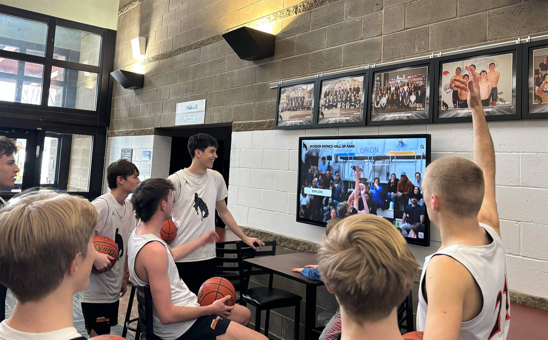
Well-designed displays naturally attract visitors and encourage group viewing and discussion
Accessibility and Inclusive Design for Recognition Displays
Recognition should celebrate all community members and be accessible to all visitors regardless of abilities or technical proficiency.
Physical Accessibility and Universal Design
Physical installation and interaction design impact usability for visitors with varied abilities.
Display Height and Approach Considerations
Thoughtful installation ensures physical access through mounting heights accommodating wheelchair users, adequate approach space for varied mobility aids, touch sensor positioning within comfortable reach ranges, and angled displays reducing glare and neck strain.
ADA accessibility guidelines provide minimum standards, but optimal inclusive design often exceeds minimums to serve diverse users comfortably.
Touch Pressure and Motor Control Requirements
Capacitive touchscreens require minimal pressure, serving users with limited strength or motor control better than resistive screens requiring firm pressure. Additional considerations include large touch targets reducing precision requirements, forgiving interaction tolerating imprecise touches, timing accommodations for users requiring longer interaction times, and alternative input methods when appropriate for specific contexts.
Vision Accommodation and Display Settings
Users with varied vision capabilities benefit from adjustable text sizing options, high-contrast visual modes, screen brightness appropriate for ambient lighting, anti-glare treatments reducing reflections, and logical content organization supporting screen reader access when appropriate.
Cognitive Accessibility and Ease of Use
Beyond physical access, cognitive accessibility ensures usability across varied technical comfort levels and cognitive abilities.
Simple Clear Language
Recognition content should use plain language avoiding unnecessary jargon, short sentences and paragraphs preventing cognitive overload, clear headings and structure supporting scanning, and consistent terminology preventing confusion.
Write for general audiences rather than specialists—visitors should easily understand content without extensive context or technical knowledge.
Intuitive Navigation Requiring Minimal Learning
Effective layouts should be self-explanatory through obvious action affordances, consistent interaction patterns, clear visual hierarchy, and helpful but unobtrusive guidance. First-time visitors should successfully navigate content without instruction manuals, staff assistance, or extended experimentation.
Observe diverse users interacting with designs during testing—if multiple users struggle with identical tasks, design requires refinement regardless of whether interactions seem obvious to designers familiar with systems.
Error Prevention and Forgiveness
Cognitive accessibility includes preventing mistakes and enabling easy recovery through clear confirmation before irreversible actions, obvious undo or back functionality, tolerant search matching varied input styles, helpful error messages suggesting corrections, and graceful degradation when unexpected conditions occur.
Learn about ultra-responsive touchscreen design that retains users through excellent usability.
Testing, Iteration, and Continuous Improvement
Great design emerges through iterative refinement based on user feedback and behavioral observation rather than theoretical perfection.
Prototyping and User Testing Methods
Testing designs with real users before full implementation identifies issues and opportunities invisible to designers.
Low-Fidelity Prototyping for Early Feedback
Initial design concepts benefit from lightweight prototyping including paper sketches showing layout concepts, clickable wireframes demonstrating navigation, simple digital mockups exploring visual direction, and interactive prototypes testing key interactions.
Low-fidelity prototypes enable rapid iteration and fundamental changes before investing in detailed design or development. Focus on structure, flow, and key decisions rather than visual polish in early stages.
Usability Testing with Representative Users
Systematic user testing involves representative participants, realistic task scenarios, observation of actual behavior versus stated preferences, identified pain points and confusion, and measured task success rates and completion times.
Test with diverse users representing your audience—age ranges, technical comfort levels, familiarity with your organization. Design serving only technically proficient young adults fails substantial portions of typical recognition display audiences.
A/B Testing Alternative Design Approaches
When choosing between viable design alternatives, A/B testing with real installations provides concrete data about effectiveness through randomized variant presentation, measured engagement metrics, statistical significance testing, and qualitative feedback from both variants.
A/B testing works particularly well for focused design decisions—button placement, navigation structures, home screen featured content—where controlled comparison reveals clear preferences.
Analytics and Behavioral Data Interpretation
Digital recognition platforms typically provide detailed analytics revealing how visitors actually use displays.
Key Metrics for Layout Effectiveness
Important indicators of layout success include total visitor engagement counts, average session duration, content views per session, most-accessed versus never-accessed content, navigation pathways visitors follow, drop-off points where engagement ends, search queries and success rates, and return visitor rates.
These metrics reveal what works and what needs improvement more accurately than subjective design opinions.
Identifying Usability Issues Through Analytics
Behavioral patterns often indicate design problems including high exit rates from specific screens suggesting confusion or disinterest, rarely accessed content possibly indicating discoverability problems, very short sessions possibly indicating difficulty finding relevant content, high search failure rates suggesting poor search implementation or missing expected content, and repeated back navigation suggesting wrong turns or unfulfilled expectations.
Analytics rarely explain why problems occur, but they reliably identify that problems exist, guiding deeper investigation and design refinement.
Design Evolution and Regular Refresh
Recognition displays require ongoing design attention maintaining relevance and engagement.
Content Refresh Strategies
Regular content updates maintain visitor interest through featured content rotation highlighting seasonal achievements, new content additions celebrating recent accomplishments, historical content expansion gradually building comprehensive archives, and visual refresh updating photography and styling periodically.
Stale unchanged displays generate declining engagement as regular visitors stop interacting after exhausting novelty. Regular updates signal active maintenance and current relevance.
Layout Optimization Based on Learning
Design should evolve based on usage evidence including navigation improvements addressing discovered pain points, visual hierarchy adjustments emphasizing popular content, new feature additions responding to user needs, and performance optimization improving responsiveness.
Effective design never finishes—continuous improvement keeps experiences optimal as technology, content, and visitor expectations evolve.

Professional installations combine traditional recognition elements with modern interactive displays through thoughtful design integration
Platform Selection Considerations for Design Success
While this guide focuses on design strategy rather than specific software platforms, recognition that technology capabilities significantly impact achievable design is important.
Design Flexibility vs. Template Constraints
Recognition software platforms vary dramatically in design customization capability.
Template-Based Platforms
Some solutions provide pre-designed templates with limited customization. Template approaches offer quick implementation and professional baseline quality, consistency across installations, and minimal design expertise requirements. However, they constrain design differentiation, may not accommodate unique content needs, and risk appearing generic across multiple organizations using identical templates.
Template platforms work well when design resources are limited and template aesthetics align well with organizational needs.
Flexible Design Systems
More sophisticated platforms enable extensive design customization through flexible layout editors, custom CSS styling support, configurable information architecture, and brand customization options. Flexible systems enable unique designs matching organizational identity, accommodation of specific content and navigation needs, and evolution as requirements change, but require greater design expertise and longer implementation timelines.
Organizations prioritizing distinctive branded experiences generally benefit from flexible platforms despite additional complexity.
Custom Development Approaches
Some organizations develop completely custom recognition interfaces. Custom development offers unlimited design possibility but requires substantial investment and ongoing maintenance expertise. Most organizations find purpose-built recognition platforms like Rocket Alumni Solutions offer sufficient flexibility while providing sustainable long-term management and support.
Content Management Impact on Design Sustainability
Beautiful launch designs become irrelevant if content management proves too difficult for ongoing updates.
Design Implications of Content Management
Sustainable recognition requires content workflows that non-technical staff can execute confidently. Design should account for how templates structure new content addition, how media upload and management functions, what editorial control exists over layout, and how bulk operations handle scale.
Designs requiring custom coding for routine updates inevitably degrade as content maintenance becomes impractical. Effective designs leverage content management systems enabling template-based updates maintaining design consistency without requiring technical intervention.
Learn about touchscreen kiosk software considerations that impact design implementation and sustainability.
Conclusion: Design Excellence Creates Engaging Recognition Experiences
Designing stunning digital hall of fame touchscreen display layouts requires balancing aesthetic beauty with functional usability, honoring achievement with engaging exploration, and maintaining consistency while accommodating diverse content. Organizations that approach recognition display design systematically—understanding audiences deeply, organizing content strategically, creating clear visual hierarchies, designing intuitive interactions, integrating multimedia thoughtfully, ensuring accessibility comprehensively, and iterating continuously based on evidence—create experiences that truly celebrate accomplishment while building pride and connection within communities.
The strategies explored in this comprehensive guide provide frameworks for design decisions from initial information architecture through detailed visual design, interaction patterns, multimedia integration, and continuous optimization. Whether designing new recognition installations or improving existing digital halls of fame, systematic design approaches transform technology investments into compelling experiences visitors actively choose to explore, spending meaningful time discovering achievements and building deeper connection to institutions and communities.
Create Stunning Recognition Displays
Discover how professional touchscreen design combined with intuitive content management creates engaging digital hall of fame displays that celebrate achievement while remaining sustainable for your team to maintain.
Explore Design SolutionsSolutions like Rocket Alumni Solutions provide purpose-built platforms combining thoughtful default design templates with customization flexibility enabling distinctive branded experiences. These specialized systems understand recognition-specific design requirements—appropriate tone and aesthetics, intuitive navigation patterns for exploration, multimedia integration supporting storytelling, and content management workflows enabling sustainable updates by non-technical staff—delivering superior design outcomes compared to generic digital signage or custom development approaches.
Remember that effective design serves recognition mission rather than existing for its own sake. Beautiful interfaces mean nothing if content management proves impractical or if visitors cannot efficiently discover relevant achievements. Start with clear objectives defining what successful recognition looks like for your organization—engagement metrics, stakeholder satisfaction, operational sustainability—then design systematically toward those outcomes through user-centered approaches, evidence-based decisions, and continuous refinement.
Your recognition displays represent institutional values, celebrate community achievement, and shape visitor impressions of organizational culture and excellence. Thoughtful design ensures these critical touchpoints appropriately honor every accomplishment while creating memorable engaging experiences that strengthen pride, connection, and community identity for everyone who explores them.
Ready to design your recognition display? Explore additional resources including digital wall of honor plaque displays, academic recognition program strategies, athletic championship display approaches, and donor recognition design principles that demonstrate effective layout and design strategies across diverse recognition contexts.