Designing touch screen experiences that truly engage users requires far more than simply making existing content tappable. Organizations investing in interactive touchscreen displays—from museums and educational institutions to corporate lobbies and public facilities—often discover that impressive hardware alone doesn’t guarantee meaningful engagement. Without thoughtful experience design addressing user needs, interaction patterns, and content strategy, even sophisticated touchscreen systems become expensive digital bulletin boards that visitors ignore.
The challenge extends beyond visual aesthetics or technical specifications. Truly engaging touchscreen experiences combine intuitive navigation that requires no instruction, content architecture matching how users actually think and explore, visual hierarchy guiding attention appropriately, responsive feedback confirming every interaction, accessibility ensuring usability for all visitors, and performance optimization maintaining smooth, frustration-free operation.
Yet many organizations approach touchscreen implementation backwards—selecting hardware first, then wondering why engagement disappoints. According to user experience research, 74% of users abandon applications they find difficult to navigate, while interfaces requiring more than three taps to reach desired content see dramatic drop-offs in completion rates. The difference between touchscreens that attract sustained engagement and those that gather dust lies primarily in experience design quality, not display size or processing power.
This comprehensive guide explores proven strategies for designing touchscreen experiences that genuinely engage users, drawing on established UX principles, interaction design best practices, accessibility standards, and field-tested approaches from successful implementations across diverse institutional settings.
Effective touchscreen experience design starts with understanding fundamental differences between touch interfaces and other interaction paradigms. Users approach touchscreens with distinct expectations shaped by smartphones and tablets—expectations that interactive displays must meet or exceed to generate meaningful engagement.

Well-designed touchscreen experiences feel natural and intuitive, requiring no instruction for basic interaction
Understanding Touch Interface Psychology and User Expectations
Before exploring specific design techniques, understanding how users perceive and interact with touchscreens establishes foundations for effective experience design.
Mental Models and Interaction Expectations
Users approach touchscreens with preconceived notions about how touch interfaces should behave, shaped primarily by smartphone and tablet experiences.
Gesture Expectations from Mobile Devices
Modern touchscreen users expect certain gestures to produce predictable outcomes including tapping to select or activate elements, swiping horizontally to browse content carousels or galleries, scrolling vertically to view longer content, pinching to zoom in or out on images and maps, and long-pressing for additional options or context menus.
When touchscreen displays violate these expectations—requiring unusual gestures, responding unpredictably, or failing to support familiar interactions—users experience cognitive friction that damages engagement. According to Nielsen Norman Group research, interfaces that conflict with established mental models increase task completion time by 30-50% and significantly reduce user satisfaction.
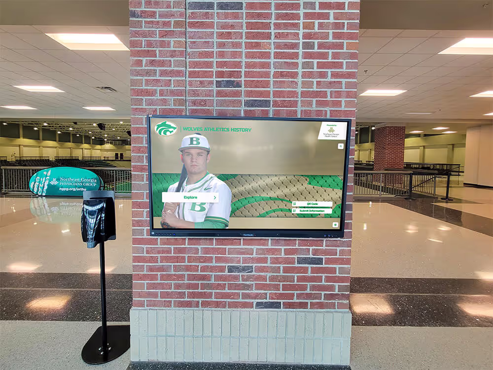
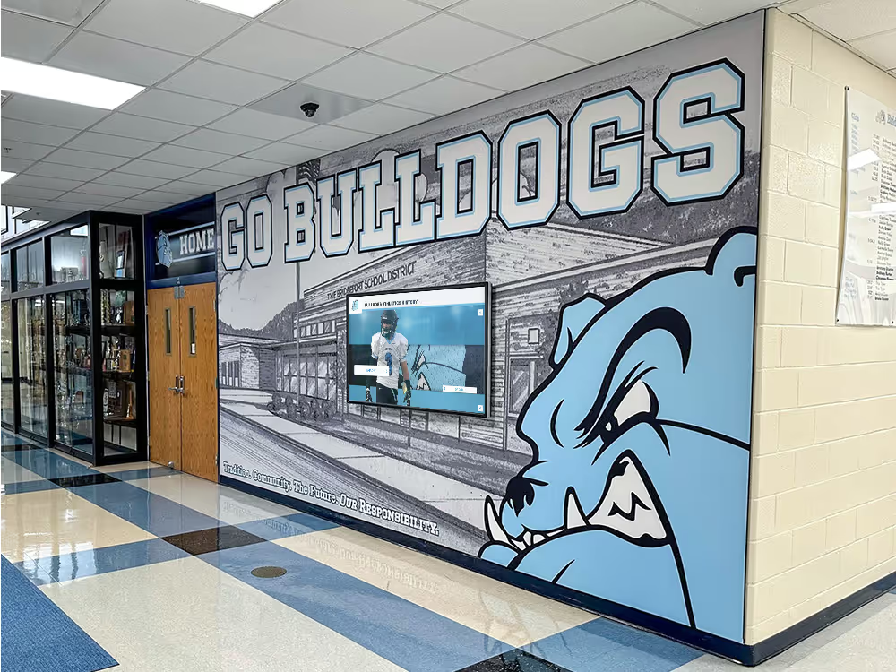
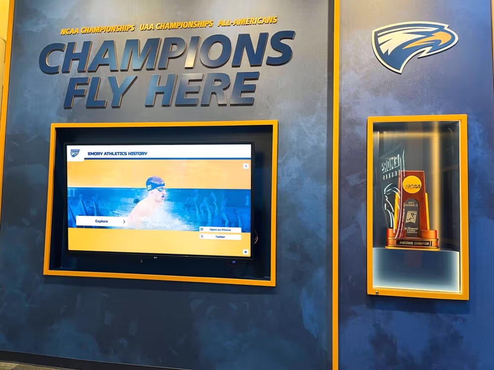
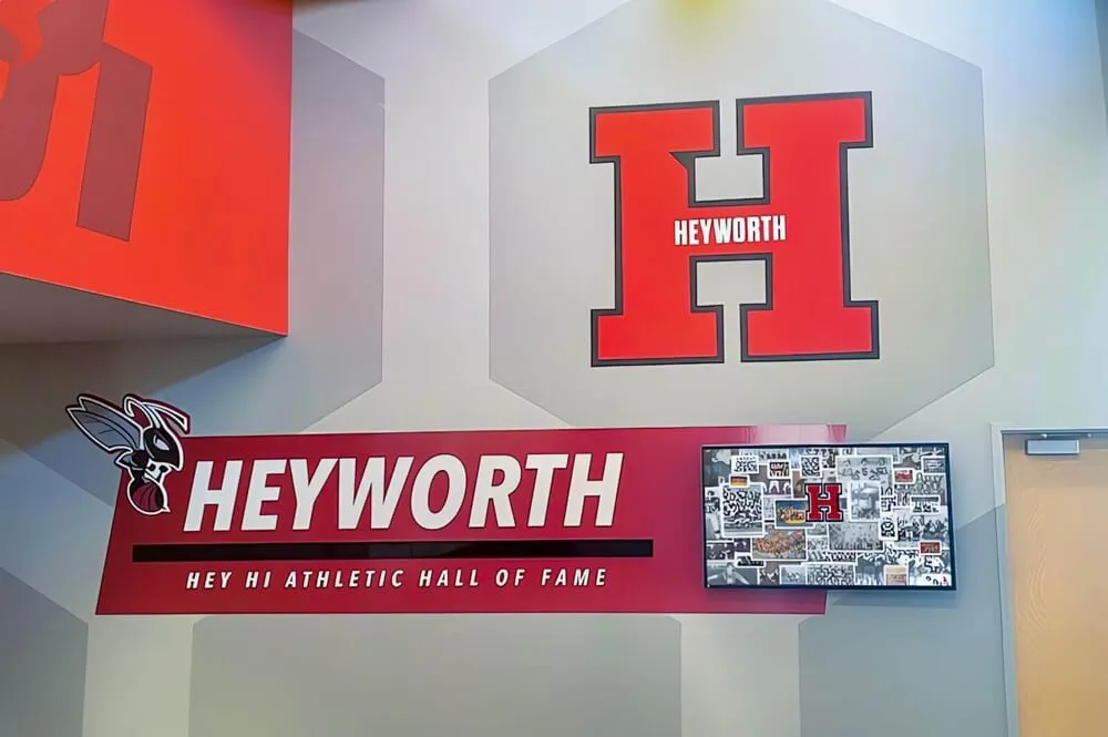
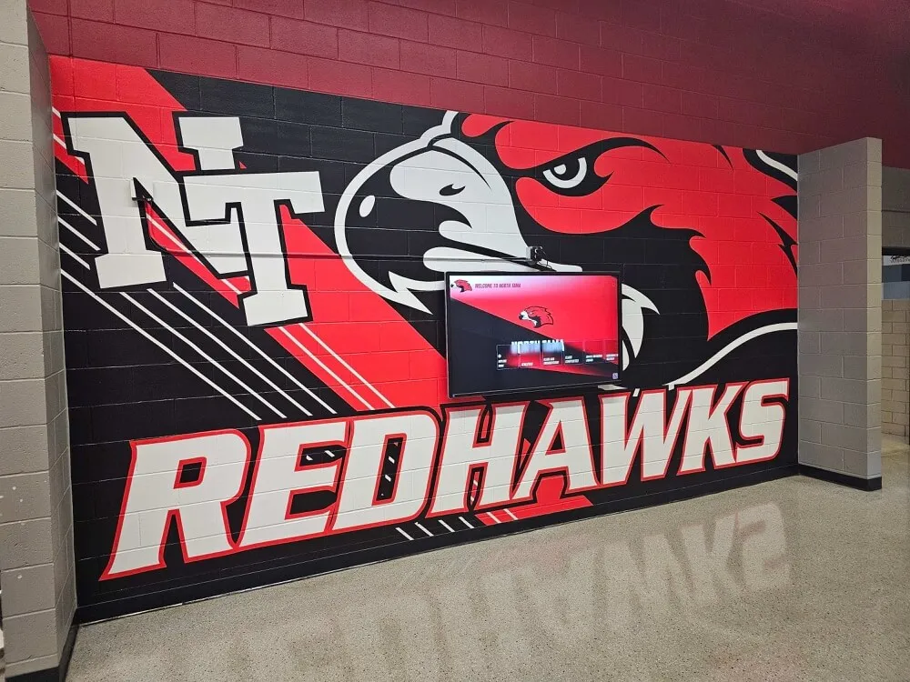
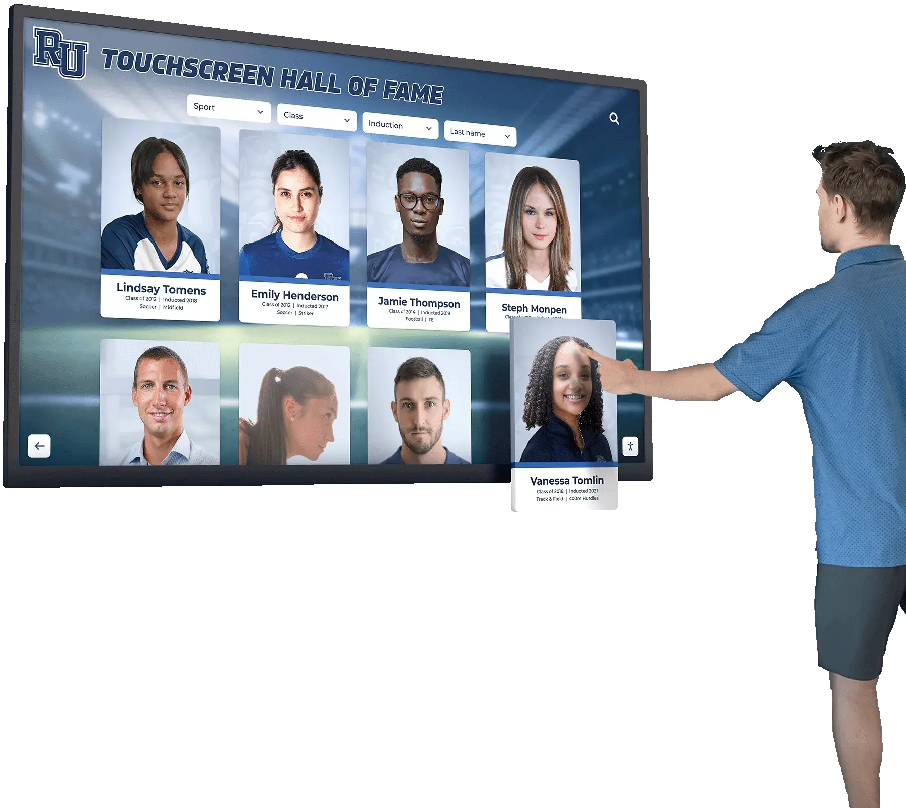
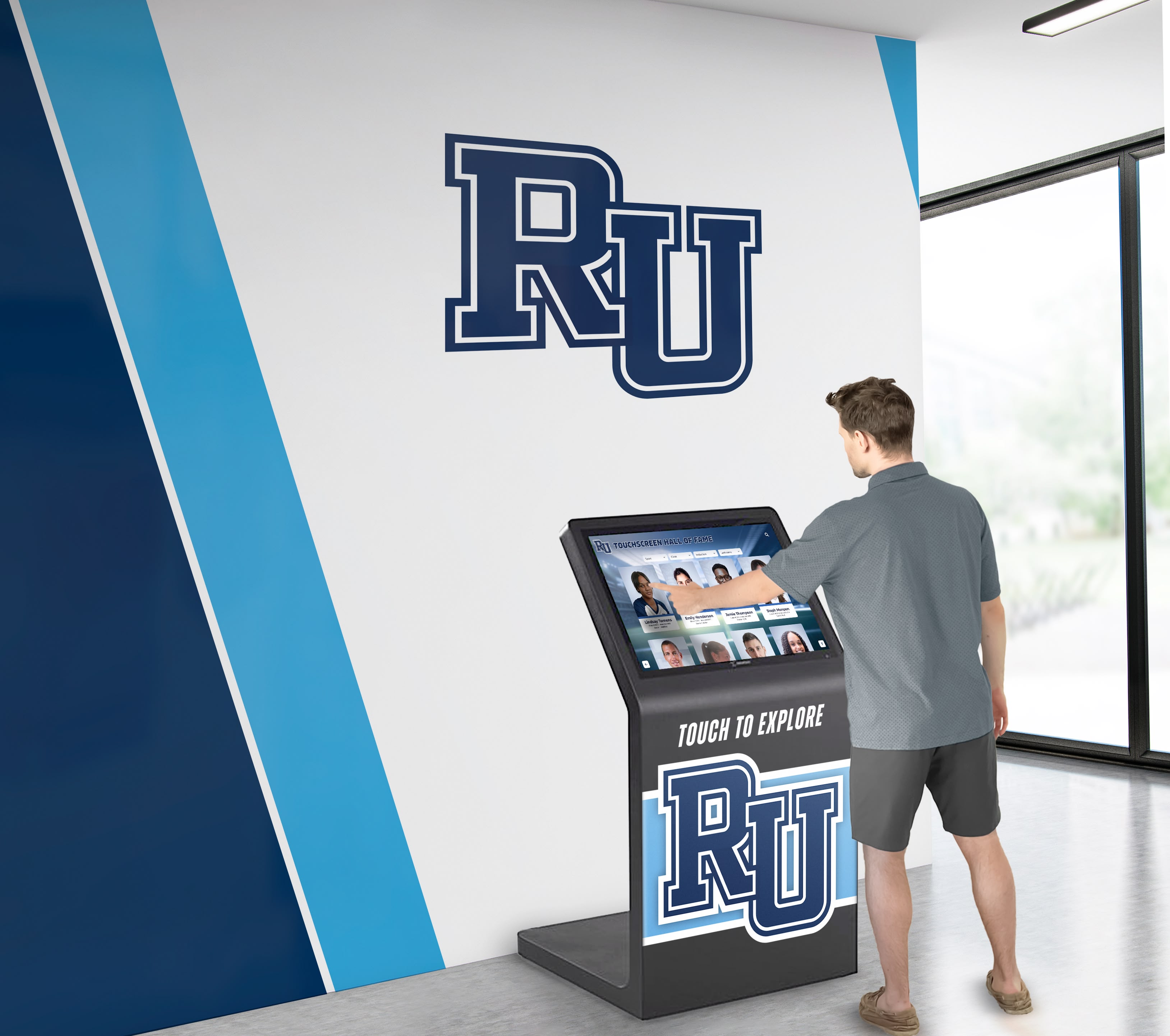
Solutions like digital recognition displays from providers like Rocket Alumni Solutions incorporate these familiar interaction patterns, ensuring visitors can navigate content intuitively without instruction or confusion.
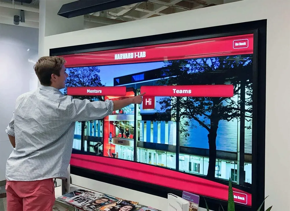
Direct Manipulation and Immediate Feedback
Touch interfaces create expectations of direct manipulation—users feel they’re physically interacting with on-screen objects rather than operating through intermediary controls. This direct manipulation requires immediate visual feedback confirming every touch, with on-screen elements responding within 100 milliseconds to maintain the illusion of physical interaction.
Delays between touch and response create frustration and uncertainty. Research from human-computer interaction studies indicates that response delays exceeding 100ms cause users to perceive interfaces as sluggish, while delays beyond 300ms prompt users to question whether their touches registered, often leading to repeated tapping and increasing frustration.
Discoverability and Visual Affordances
Unlike desktop interfaces where mouse cursor changes indicate interactive elements, touchscreen users rely entirely on visual design to understand what’s tappable. Clear visual affordances—design characteristics signaling interactivity—prove essential for usable touch interfaces.
Effective touchscreen designs employ consistent visual patterns including buttons with dimensional appearance suggesting pressability, color contrast distinguishing interactive from static elements, text links using conventional styling with underlines or distinct colors, iconography supplementing text for universal comprehension, and white space preventing accidental touches and clearly separating controls.
Learn how interactive display technology implements these principles effectively in institutional settings requiring intuitive operation.

Direct manipulation through touch creates engaging, natural interaction with digital content
The Three-Second Rule and First Impressions
Touchscreen interfaces live or die in their opening moments—users decide within three seconds whether an interface warrants exploration or should be abandoned.
Immediate Value Communication
Opening screens must instantly communicate what the touchscreen offers and why visitors should engage. Ambiguous interfaces that require reading instructions or exploring menus to understand purpose fail to capture attention during crucial first impressions.
Effective home screens include clear headlines explaining the touchscreen’s purpose, compelling preview content demonstrating value, prominent search or browse options enabling immediate action, and minimal text paired with strong visuals capturing attention quickly.
According to UX research, interfaces requiring more than 10 seconds to understand purpose experience 60-70% abandonment rates as users simply walk away rather than investing time to decipher offerings.
Cognitive Load and Initial Overwhelm
While touchscreens can host extensive content libraries, presenting too many options initially creates cognitive overload that paralyzes decision-making. Research in choice architecture demonstrates that excessive initial options reduce engagement—users confronted with 20+ choices experience decision fatigue and often choose nothing.
Successful interfaces employ progressive disclosure, revealing complexity gradually as users demonstrate interest and navigate deeper into content. Home screens might present 4-6 primary content categories, with subcategories and detailed content appearing as users drill down into areas of interest.
Attention Spans and Interaction Duration
Unlike desktop or mobile personal devices, public touchscreens compete for attention in environments full of distractions where users have no inherent commitment to completing tasks.
The Five-Minute Engagement Window
Research on public kiosk interaction patterns indicates median engagement duration of 60-90 seconds, with highly engaging content extending interactions to 3-5 minutes. Beyond five minutes, user attention dramatically declines unless content is extraordinarily compelling or necessary for completing required tasks.
This limited engagement window requires ruthless prioritization of content and streamlined navigation paths. Users should access desired information within 2-3 taps from the home screen, with deeper content available for those choosing extended exploration.
Graceful Exit and Re-engagement
Public touchscreens must accommodate interrupted interactions—users frequently abandon sessions mid-exploration due to external distractions, time constraints, or changing needs. Effective interfaces reset gracefully to attract states after 30-60 seconds of inactivity, preventing subsequent users from encountering previous visitors’ incomplete sessions.
Attract loops—engaging motion graphics or videos showcasing content highlights—draw attention and invite interaction when touchscreens sit idle. These loops should clearly communicate touch-to-begin functionality while showcasing compelling content previews that motivate engagement.
Discover effective attract loop design in digital recognition displays that maintain visitor engagement.
Core Principles of Engaging Touch Interface Design
Specific design principles transform ordinary touchscreens into compelling, intuitive experiences that users genuinely enjoy exploring.
Touch Target Size and Spacing Standards
Physical constraints of human fingers dictate minimum dimensions for usable touch interfaces.
The 44-Pixel Minimum Standard
Apple’s Human Interface Guidelines and other touch design standards recommend minimum touch target sizes of 44×44 pixels (approximately 9mm²) for essential interactive elements. Research supporting this standard finds that smaller targets dramatically increase error rates, with 30×30 pixel targets producing 2-3x more accidental misses than properly-sized alternatives.
For public touchscreens where users stand rather than sit comfortably, conservative designs employ 60×60 pixel minimum targets accounting for reduced precision in standing postures and accommodation of diverse user motor control capabilities.
Spacing and Accidental Touch Prevention
Beyond individual target size, spacing between interactive elements prevents frustrating accidental touches. Minimum spacing of 8-12 pixels between distinct touch targets reduces errors where users intending to tap one element inadvertently activate adjacent controls.
This spacing consideration proves particularly important for edge-positioned controls—buttons along screen edges benefit from extra spacing or padding since users approaching from outside the display may contact screens before achieving target precision.
Responsive Touch States
Every touch should trigger immediate visual feedback confirming the interaction. Common patterns include subtle scale increase or “press” animation when elements are touched, color change indicating active state, haptic feedback if hardware supports tactile response (though uncommon in large displays), and smooth transitions to next screens or content states.
According to interaction design research, immediate feedback (under 100ms) creates sense of responsiveness that users perceive as quality and polish, while delayed feedback feels sluggish even when total task completion time remains unchanged.
Visual Hierarchy and Information Architecture
Clear visual organization helps users quickly parse content and identify navigation paths without conscious effort.
Size, Color, and Contrast Hierarchy
Visual hierarchy employs multiple dimensions to communicate relative importance including size—larger elements signal greater importance or priority, color—vibrant colors draw attention to primary actions while muted colors recede, contrast—high-contrast elements stand out against backgrounds, position—top-left content receives first attention in Western interfaces, and typography—bold, larger fonts indicate headings and key content.
Effective touchscreen designs establish clear primary, secondary, and tertiary visual levels. Primary elements (main navigation, key calls to action) should be immediately apparent, secondary elements (content categories, filtering options) should be easily discoverable, and tertiary elements (settings, help, fine print) should be accessible without cluttering primary views.
Content Chunking and Grouping
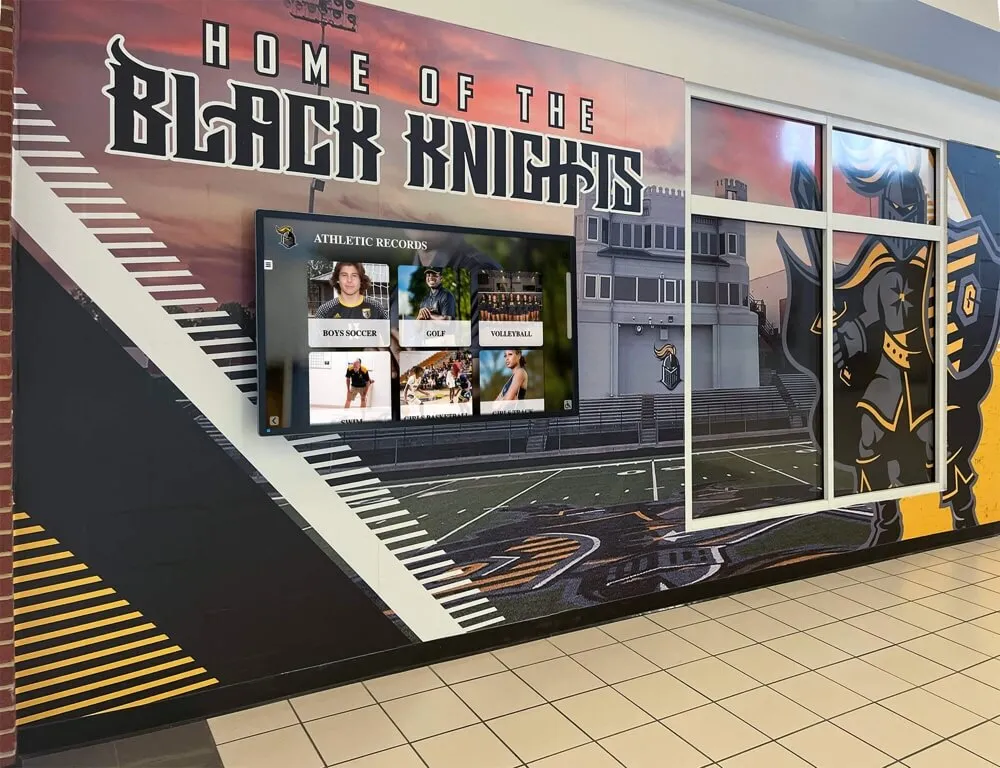
Research in cognitive psychology demonstrates that humans process information most effectively in small chunks, typically groups of 3-5 related items. Touchscreen interfaces should organize content into logical groups with clear relationships rather than presenting undifferentiated lists of options.
Visual grouping techniques include white space separating distinct content sections, background colors or subtle borders containing related items, consistent alignment creating implicit relationships, and heading labels explicitly identifying grouped content.
Learn about effective content organization in digital display implementations serving diverse institutional needs.

Clear visual hierarchy helps users instantly understand navigation options and content organization
F-Pattern and Z-Pattern Scanning
Eye-tracking research reveals predictable scanning patterns users employ when encountering new screens. The F-pattern describes how users scan text-heavy interfaces—horizontal scan across the top, second horizontal scan partway down, then vertical scan of the left side. The Z-pattern applies to image-heavy or marketing-focused screens—scanning from top-left to top-right, diagonally to bottom-left, then across to bottom-right.
Effective touchscreen layouts position critical content and navigation along these natural scanning paths, ensuring users encounter important elements without requiring extensive visual searching.
Typography and Readability for Standing Users
Text legibility requirements differ significantly between handheld devices and large touchscreen displays where users stand at distance.
Size and Reading Distance Calculations
Comfortable reading requires text sized appropriately for viewing distance. Public touchscreens typically position users 18-36 inches from displays, requiring larger text than smartphone screens viewed at 10-12 inches.
Minimum body text sizes for touchscreen displays include 18-20 point fonts for primary content at 24-30 inch viewing distance, 24-28 point fonts for primary navigation and buttons, and 32-48 point fonts for headings and key information. These larger sizes ensure readability for users with varied visual acuity including older adults with age-related vision changes.
Font Selection and Contrast
Sans-serif fonts generally provide better readability on screens than serif alternatives, with clean, simple letterforms reducing rendering issues at various sizes. Popular touchscreen fonts include Open Sans, Roboto, Source Sans Pro, and Lato—all designed specifically for digital readability.
Color contrast between text and backgrounds dramatically affects readability. WCAG 2.1 accessibility standards require minimum 4.5:1 contrast ratios for normal text and 3:1 for large text (18pt+), though more conservative designs target 7:1 or higher for maximum legibility in varied lighting conditions.
Line Length and Paragraph Structure
Optimal line length for comfortable reading spans 50-75 characters, approximately 10-12 words per line. Longer lines require excessive eye movement, while shorter lines feel choppy and reduce reading flow. Paragraph breaks every 2-4 sentences create white space that prevents text-heavy screens from feeling overwhelming.
For public touchscreens competing for attention, shorter text blocks prove more effective than lengthy explanations. Key information should be frontloaded in opening sentences, with additional details available through progressive disclosure for interested users.
Navigation Patterns and Wayfinding
Intuitive navigation enables users to explore content confidently without getting lost or frustrated.
Consistent Navigation Placement
Research in user experience consistency demonstrates that navigation elements should occupy consistent screen positions across all views. Common patterns include:
- Top navigation bars for primary categories
- Left sidebar navigation for hierarchical content
- Bottom navigation for core functions
- Floating action buttons for primary tasks
- Home buttons in consistent corners
When navigation shifts positions between screens, users must visually search for controls rather than relying on muscle memory, increasing cognitive load and slowing task completion.

Intuitive navigation enables confident exploration without instructions
Breadcrumb Trails and Context
Users exploring multi-level content hierarchies benefit from persistent context indicating current location and path taken to arrive there. Breadcrumb navigation—showing Home > Category > Subcategory > Current Item—enables easy backtracking and provides orientation within content structures.
For touchscreen displays presenting large content collections, search functionality alongside browse navigation accommodates different user preferences. Some visitors prefer directed search when knowing what they seek, while others enjoy exploratory browsing to discover unexpected content.
Maximum Three-Tap Rule
User experience research consistently demonstrates that task completion rates drop significantly when required interactions exceed 3-4 steps. Effective touchscreen experiences organize content so users can reach any desired information within three taps from the home screen.
This constraint forces ruthless content prioritization and efficient information architecture. If important content sits buried four or five levels deep, most users will never discover it, regardless of quality.
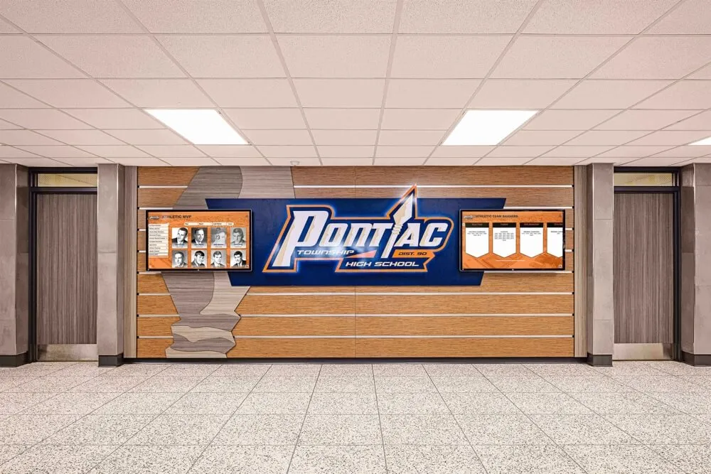
Effective approaches to digital wayfinding and navigation demonstrate these principles across institutional environments.
Content Strategy and Storytelling for Touchscreens
Technical interface design means little without compelling content that motivates exploration and sustains engagement.
The Content-First Design Philosophy
Successful touchscreen experiences begin with content strategy, not interface wireframes.
Understanding User Goals and Questions
Before designing navigation or visual layouts, identify what users want to accomplish with your touchscreen. Different contexts drive different content priorities:
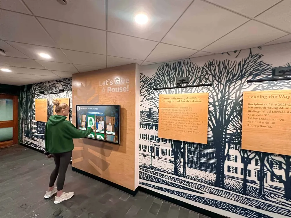
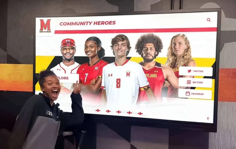
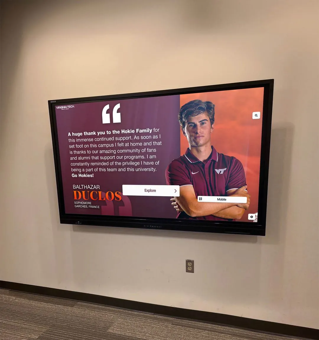
- Recognition displays: Users search for familiar names, browse achievements, explore history
- Wayfinding kiosks: Users seek specific locations, service information, directions
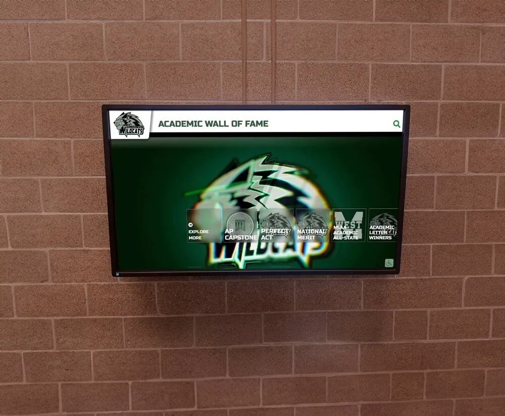
- Educational exhibits: Users explore topics of interest, watch videos, interact with media
- Donor walls: Supporters search for contributors, review giving impacts, find inspiration
- Museum displays: Visitors learn about artifacts, watch documentaries, access deeper context
Content should directly address these goals with minimal friction, providing exactly what users seek without requiring extensive navigation or information filtering.
Content Prioritization and Progressive Disclosure
Not all content deserves equal prominence. Effective touchscreen experiences employ strict prioritization including primary content addressing 80% of user goals prominently displayed and easily accessible, secondary content supporting common but less frequent needs available through clear paths, and tertiary content serving niche interests or comprehensive reference available but not cluttering primary views.
Progressive disclosure reveals complexity gradually—home screens present broad categories, category screens show subcategories and featured content, and detail screens provide comprehensive information with options for deeper exploration. This layered approach prevents overwhelming users while accommodating both casual browsers and deeply interested researchers.
Multimedia Content and Engagement
Touchscreens enable rich multimedia that text-only displays cannot match, but multimedia should enhance rather than distract from content goals.
Video Content Best Practices
Video represents one of the most engaging touchscreen content types when implemented thoughtfully. Effective video strategies include keeping individual videos short (60-180 seconds) to match attention spans, providing clear previews showing video topics before playback, enabling touch-to-pause and scrubbing through content, using closed captions ensuring accessibility, and optimizing video quality for display size and viewing distance.
Auto-play video creates mixed results. While movement attracts attention in attract loops, auto-play during active sessions interrupts user control and can frustrate visitors focused on other content.
According to research from digital exhibit designers, video engagement peaks with 90-120 second duration—long enough to deliver meaningful content but short enough to maintain attention in standing viewing contexts.
Image Galleries and Visual Browsing
High-quality photography and visual content drive strong engagement on touchscreens, particularly for recognition displays, historical archives, and artistic content. Effective image presentation includes thumbnail galleries enabling visual scanning, full-screen viewing with pinch-to-zoom functionality, clear captions providing context and attribution, swipe navigation between related images, and download or sharing options where appropriate.
Image quality dramatically affects perceived professionalism. Blurry, poorly lit, or low-resolution images damage credibility regardless of interface polish. Professional photography or careful digital restoration of historical images represents essential investment for visually-focused touchscreen content.
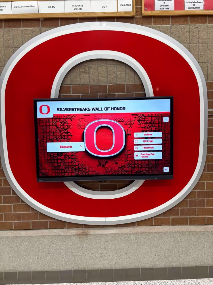
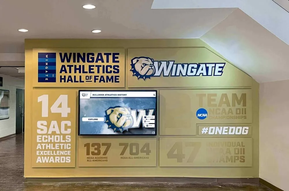
Discover effective visual presentation in digital recognition systems that celebrate institutional achievements.
Interactive Elements and Gamification
Interactive features beyond simple browsing increase engagement and time-on-task. Successful interactive elements include quiz or challenge modules testing knowledge, before-and-after sliders comparing historical photos, interactive maps enabling location-based exploration, timeline scrubbers moving through chronological content, comparison tools evaluating multiple items side-by-side, and achievement systems rewarding exploration.
These gamification elements prove particularly effective for educational content and younger audiences, though they should enhance rather than distract from core content goals.

Compelling multimedia content and intuitive interaction sustain visitor engagement
Search Functionality and Content Discovery
As content libraries grow, effective search becomes essential for enabling users to find specific information quickly.
Search Interface Design
Touchscreen search requires thoughtful implementation addressing unique interaction patterns. Best practices include prominent search fields with clear magnifying glass icons, auto-suggest displaying likely results as users type, voice search options reducing typing friction, recent search history enabling quick re-access, and clear results formatting with relevance ranking.
Virtual keyboards for touchscreen typing should employ large key targets (minimum 50×50 pixels), provide autocomplete and correction, support both alphabetic and numeric entry, and enable quick access to common special characters.
Filtered Browse as Search Alternative
Not all users formulate specific search queries—many prefer exploratory browsing narrowed through filters. Effective filtered browse experiences allow users to select multiple filter criteria (date ranges, categories, achievement types), show result counts before applying filters, enable easy filter removal or modification, and persist filter states when users navigate into detail views and back.
This filtered approach often proves more effective than search for users exploring unfamiliar content where they don’t yet know what they’re seeking.
Comprehensive digital content management approaches enable sophisticated search and browse functionality.
Accessibility and Inclusive Design for Touchscreens
Truly engaging touchscreen experiences welcome all users regardless of abilities, implementing inclusive design from the foundation rather than adding accessibility as afterthought.
Visual Accessibility Standards
Many users experience visual challenges affecting touchscreen usability—from permanent conditions like low vision to temporary challenges like viewing screens in bright sunlight.
Color Contrast and Visibility
WCAG 2.1 Level AA compliance requires minimum 4.5:1 contrast ratios between text and backgrounds for normal text, and 3:1 ratios for large text (18pt+ regular, 14pt+ bold). More conservative designs target 7:1 ratios, exceeding accessibility minimums to ensure readability across varied lighting conditions and user capabilities.
Beyond minimum compliance, effective contrast design includes avoiding color-only information encoding—if colors distinguish categories, also include icons, labels, or patterns enabling colorblind users to differentiate content. Common color vision deficiencies affect approximately 8% of men and 0.5% of women, requiring thoughtful color palette selection.
Testing tools like WebAIM’s contrast checker help designers verify color combinations meet accessibility standards before implementation.
Text Sizing and Zoom Capability
While designing with large default text ensures baseline readability, true accessibility requires text scaling options enabling users to increase font sizes to comfortable levels. Effective implementations provide at least three size options (standard, large, extra-large) with controls accessible from all screens.
Alternatively, pinch-to-zoom functionality familiar from mobile devices enables users to magnify specific content regions. This zoom must maintain readability—text should reflow rather than simply scaling images, and zoomed views should enable panning to access off-screen content.
High Contrast and Visual Modes
Some users benefit from specialized visual modes including high contrast mode with stark black/white or black/yellow color schemes, inverted color mode reducing bright backgrounds in dim environments, reduced motion mode minimizing animations for vestibular sensitivity, and simplified interface mode decluttering screens for cognitive accessibility.
These modes should be easily activated and remain persistent across sessions until users explicitly change settings.
Physical and Motor Accessibility
Touchscreen interfaces must accommodate users with diverse motor control capabilities and physical limitations.
Touch Target Sizing and Positioning
While 44×44 pixels represents accessibility minimum, more conservative designs employ 60×60 pixel or larger targets for critical interactions. This generous sizing accommodates users with reduced motor control including older adults, people with tremors or limited fine motor control, and users with prosthetics or assistive devices.
Interactive elements should avoid extreme screen edges and corners where users may struggle to reach. Particularly for kiosk-style installations, critical controls should occupy the central 70% of screen area, with wheelchair-accessible installations positioning key content in the lower 70% of displays.
Alternative Input Methods
True accessibility extends beyond touch to accommodate users unable to interact through direct touch. Alternative input modes include voice control for hands-free operation, switch control for users with limited mobility, keyboard/remote control for users unable to reach displays, and external device connection enabling assistive technology integration.
While these accommodations may require additional investment, they ensure touchscreen experiences serve all community members equitably.
Learn about comprehensive accessibility implementation in inclusive digital display design serving diverse populations.
Cognitive and Neurodiversity Accommodations
Cognitive accessibility ensures interfaces work for users with varied information processing styles and abilities.
Clear Language and Plain Writing
Content should employ clear, straightforward language at appropriate reading levels for target audiences. Writing guidelines include using common words rather than jargon or technical terms, keeping sentences short (15-20 words maximum), employing active voice construction, defining necessary technical terms, and organizing content with clear headings and bullet points.
For general public audiences, target reading levels of 6th-8th grade ensure broad accessibility, while specialized audiences may warrant higher complexity.
Reduced Cognitive Load
Interfaces should minimize working memory demands through consistent navigation reducing learning curves, clear wayfinding preventing users from feeling lost, confirmation dialogs for destructive actions preventing mistakes, forgiving designs allowing easy error correction, and progressive disclosure preventing information overwhelming.
Cognitive load consideration proves particularly important for stress-inducing contexts like wayfinding in healthcare facilities or courthouse information systems where users may be anxious or distracted.
Customization and Preference Accommodation
Users have diverse preferences for how they consume information. Effective touchscreen experiences accommodate variety including text versus video content preferences, exploratory browse versus direct search approaches, detailed versus summary information options, and linear versus non-linear navigation patterns.
Providing multiple paths to the same content ensures interfaces work for varied cognitive styles and learning preferences.
Technical Optimization and Performance
User engagement depends on technical excellence—sluggish interfaces frustrate users regardless of content quality.
Response Time and Performance Benchmarks
Users perceive interfaces as responsive or sluggish based on interaction timing.
The 100ms Touch Response Standard
Touch targets should provide visual feedback within 100 milliseconds of contact. This immediate response creates perception of direct manipulation—users feel they’re touching actual objects rather than operating through layers of abstraction.
Achieving this standard requires optimized touch event handling, pre-loaded interface assets preventing load delays, hardware-accelerated graphics rendering, and careful performance profiling identifying bottlenecks.
Content Load Times and Perceived Performance
While high-resolution images and video content may require loading time, perceived performance remains acceptable when interfaces provide clear loading indicators showing progress, immediate skeleton screens outlining content structure, and progressive content rendering displaying partial content while remainder loads.
Research in user experience timing indicates that operations under 1 second feel instantaneous, delays of 1-3 seconds feel responsive if progress is shown, and delays exceeding 3 seconds prompt users to question whether systems are working. Delays beyond 10 seconds typically result in user abandonment.
Smooth Animations and Transitions
Screen transitions and content animations should maintain 60 frames per second (16.67ms per frame) for smooth, professional appearance. Choppy animations damage perceived quality even when functional performance remains adequate.
Hardware acceleration and careful animation implementation ensure smooth motion. Modern touchscreen systems should leverage GPU rendering for animations, simplify or disable effects on lower-powered hardware, and provide reduced-motion options for accessibility.
Learn about performance optimization for touchscreen systems ensuring responsive user experiences.
Hardware Selection and Specifications
Software optimization means little if hardware cannot support smooth operation.
Display Quality and Viewing Angles
Commercial-grade displays designed for public installation provide superior reliability and viewing angles compared to consumer alternatives. Key specifications include IPS or OLED panels ensuring 178-degree viewing angles, anti-glare coatings reducing reflections in bright environments, commercial-rated backlights supporting 16+ hours daily operation, and VESA mounting compatibility for installation flexibility.
Display resolution should match content detail—4K displays enable fine detail examination, while 1080p suffices for primarily typographic interfaces at typical viewing distances.
Touch Technology Selection
Multiple touch sensing technologies suit different applications. Capacitive touch provides the smoothest, most responsive experience familiar from smartphones and tablets, requiring direct finger contact or specialized styluses, supporting multi-touch gestures naturally, and offering superior accuracy and responsiveness.
Infrared touch systems support gloved operation and stylus use beyond specialized capacitive styluses, tolerate harsh environments better than capacitive alternatives, and enable very large displays (100"+ diagonal) economically.
Projected capacitive touch represents the premium choice for public installations where users expect smartphone-like responsiveness and multi-touch capability.
Processing Power and Memory
Touchscreen applications displaying multimedia content require substantial processing capability. Minimum specifications for professional installations include quad-core processors at 2.0GHz or higher, 8GB+ RAM supporting smooth multitasking, SSD storage for fast content loading, and dedicated graphics processing for animation and video.
Underpowered hardware creates frustrated users and damages institutional credibility through sluggish performance that feels cheap or neglected.
Content Management and Updates
Even excellently designed touchscreen experiences become stale without regular content updates.
Cloud-Based Content Management Systems
Modern touchscreen displays employ cloud-based content management enabling remote updates from any internet-connected device, scheduled content publishing for campaigns and events, user permission systems controlling who can modify content, version control tracking changes and enabling rollback, and analytics dashboards measuring engagement and usage patterns.
Solutions like Rocket Alumni Solutions provide comprehensive cloud-based platforms designed specifically for institutional recognition and information displays, enabling straightforward content management without requiring technical expertise.
Update Frequency and Content Freshness
Regular content updates maintain visitor engagement and encourage repeat interaction. Effective update schedules vary by application:
- Recognition displays: Add new inductees immediately, rotate featured profiles weekly
- Event information: Update daily or real-time for dynamic schedules
- Educational content: Refresh featured content monthly, add new material quarterly
- Historical archives: Add newly discovered materials as they become available
Visitors who encounter identical content across multiple visits lose motivation to engage, while fresh content rewards return interactions and builds reputation for vibrant, current information.

Cloud-based content management enables easy updates and mobile content extensions
Testing and Iteration for Continuous Improvement
Launching touchscreen experiences represents just the beginning—ongoing testing and refinement maximize effectiveness over time.
User Testing Methodologies
Direct observation of real users interacting with touchscreens reveals issues designers cannot anticipate.
Moderated Usability Testing
Formal usability testing observes representative users attempting realistic tasks while researchers document challenges, confusion points, and success rates. Effective testing includes recruiting participants matching target user demographics, creating realistic task scenarios (find specific information, complete registration process), observing without interrupting or helping, and conducting post-session interviews discussing experience.
Even 5-8 participants typically reveal 80% of usability issues, making moderated testing valuable without requiring extensive resources.
Unmoderated Observation
Installing cameras or screen recording software enables passive observation of real-world usage patterns including which features users engage most, where users abandon interactions, how long users spend exploring content, common navigation paths and sequences, and gestures or interactions users attempt that interfaces don’t support.
This real-world observation complements formal testing by capturing authentic behavior in natural contexts rather than artificial testing scenarios.
A/B Testing and Multivariate Experiments
For touchscreens with substantial traffic, A/B testing compares design alternatives to determine which produces better engagement. Common experiments include testing different home screen layouts or content priorities, comparing navigation structures or menu organizations, evaluating call-to-action button sizes or positioning, and assessing content presentation formats (video vs. text vs. interactive).
Analytics platforms track engagement metrics for each variant, identifying winners through statistical significance testing.
Analytics and Engagement Metrics
Quantitative measurement enables data-driven improvement decisions.
Key Performance Indicators
Meaningful metrics for touchscreen engagement include session duration (median time users spend interacting), interaction depth (average number of screens or taps per session), task completion rates for goal-oriented content, search usage and success rates, content popularity rankings, and user return rates for multi-visit environments.
Comparing these metrics over time reveals trends indicating whether engagement is improving or degrading as content and interfaces evolve.
Conversion and Goal Tracking
For touchscreens supporting specific outcomes—capturing contact information, directing visitors to locations, encouraging donations, or registering for events—conversion tracking measures how effectively interfaces drive desired actions.
Low conversion rates despite high traffic indicate usability problems preventing users from completing goals, while strong conversion validates that interfaces effectively support user needs.
Heatmaps and Interaction Visualization
Touch heatmaps visualize where users interact with screens, revealing which content attracts attention and which areas users ignore. This visualization helps designers understand whether users notice important content or if critical elements occupy visual dead zones receiving no attention.
Engagement tracking from digital display analytics platforms enables continuous optimization.
Continuous Improvement Processes
Testing reveals opportunities; systematic improvement processes ensure insights translate to better experiences.
Regular Review Cycles
Establish scheduled review processes including weekly review of analytics and error reports, monthly assessment of user feedback and support questions, quarterly comprehensive usability testing, and annual major interface reviews considering significant redesigns or restructuring.
Regular cadence ensures touchscreen experiences receive sustained attention rather than languishing after initial launch excitement fades.
Incremental Enhancement Philosophy
Rather than planning major redesigns, effective improvement employs continuous incremental enhancement—small, regular improvements compound over time while minimizing disruption to users who have learned existing interfaces.
Common incremental improvements include refining content based on popularity metrics, adjusting visual hierarchy emphasizing highly-engaged content, simplifying navigation paths to frequently-accessed content, fixing discovered usability pain points, and refreshing visual design maintaining contemporary aesthetics.
User Feedback Integration
Direct user feedback provides qualitative insights complementing quantitative analytics. Feedback mechanisms include touch-activated survey prompts at session end, QR codes linking to online feedback forms, email or web contact information for detailed feedback, and periodic intercept surveys in installation locations.
Treating users as partners in improvement creates better experiences while building community investment in touchscreen success.
Specialized Touchscreen Applications and Design Considerations
Different contexts require adapted design approaches addressing unique user needs and environmental constraints.
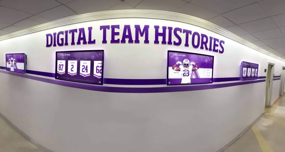
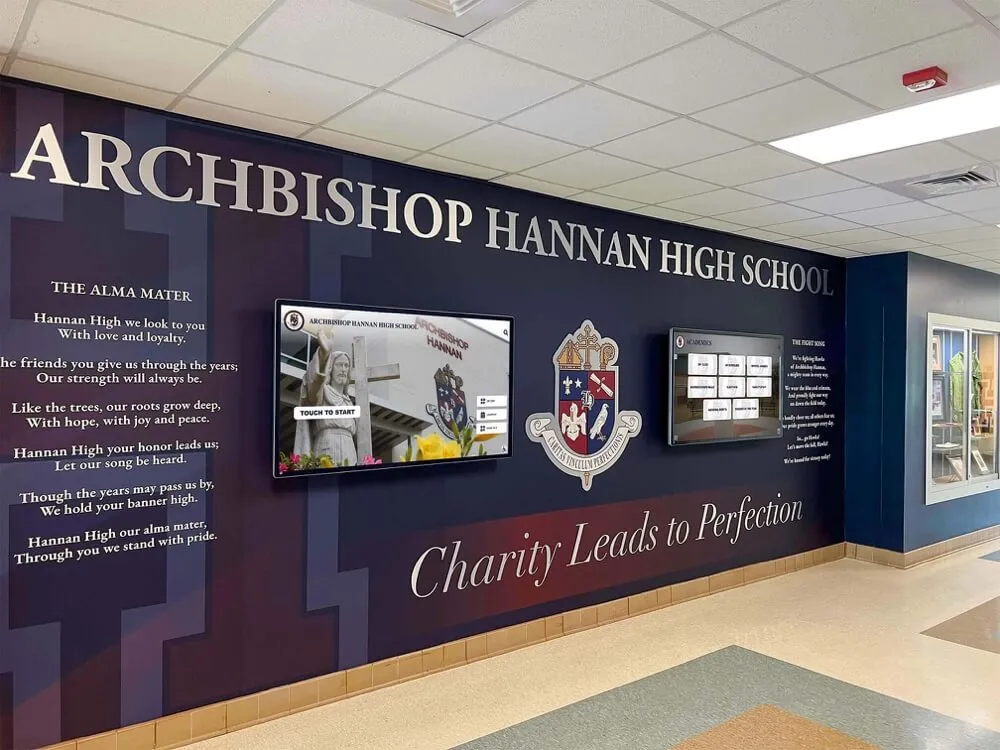
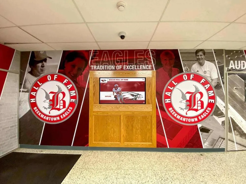
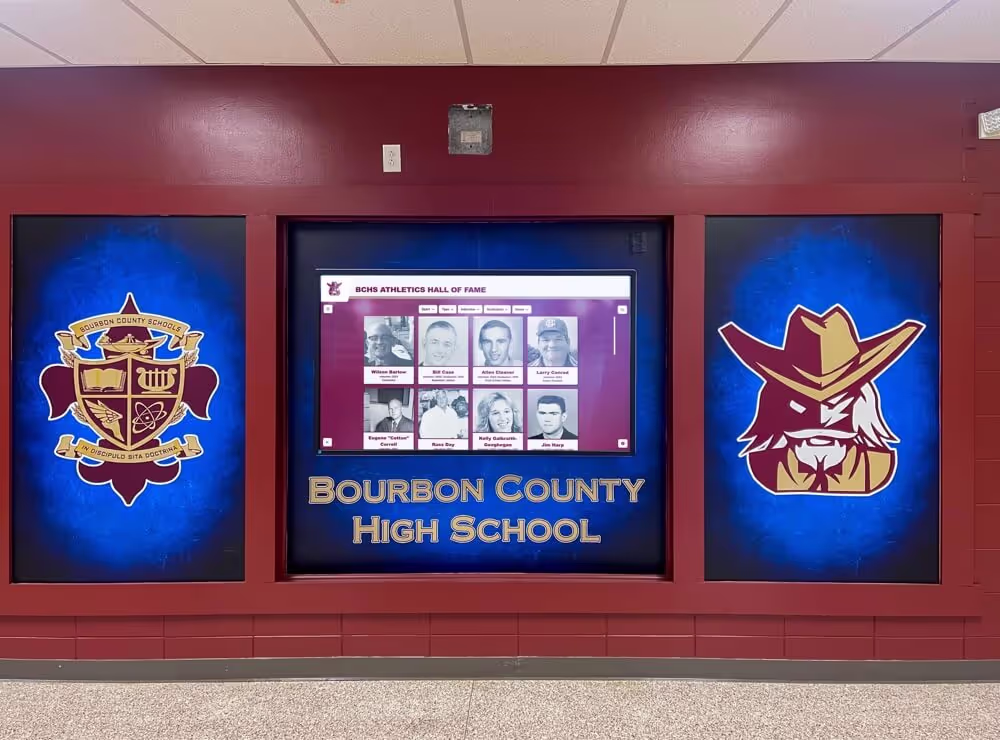
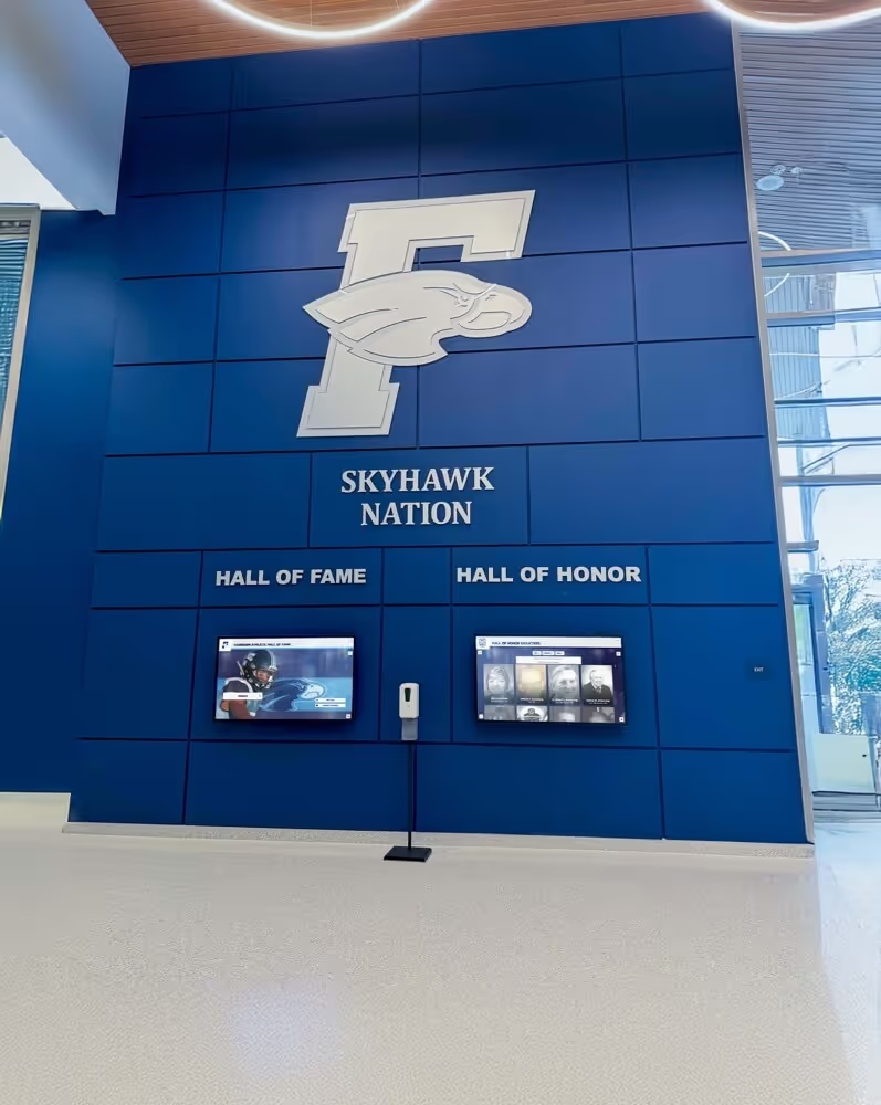
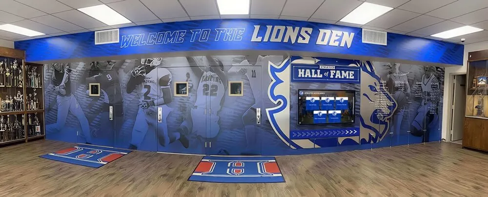
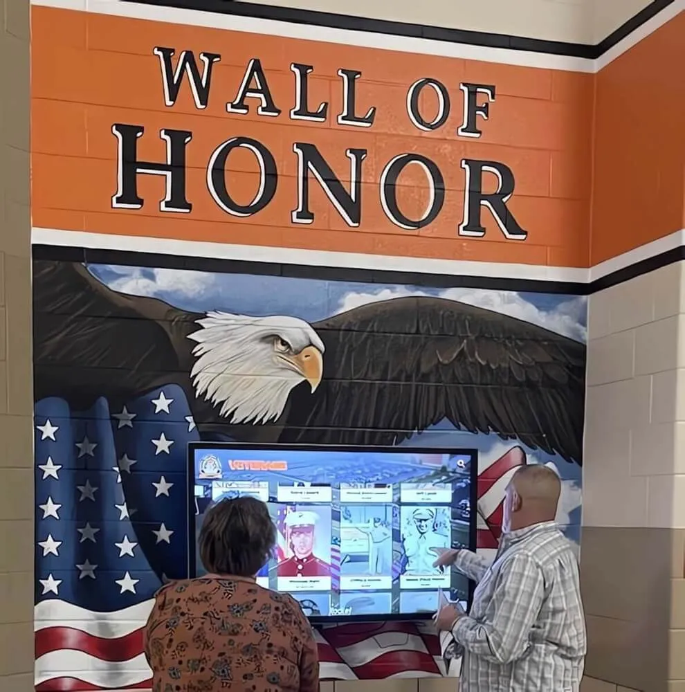
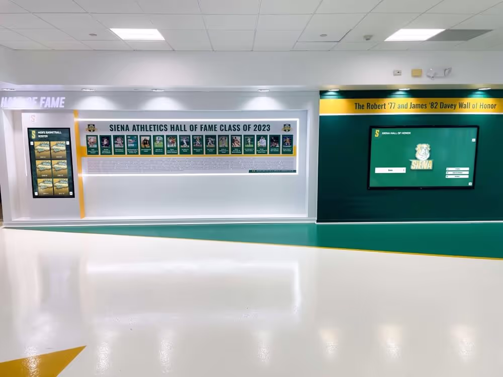
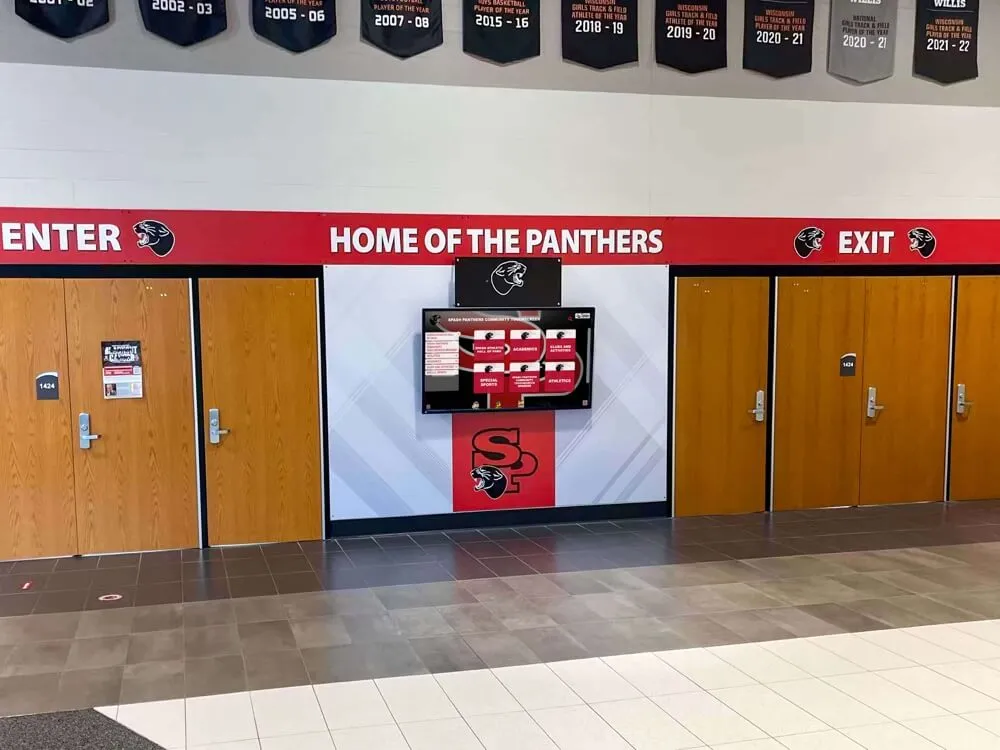
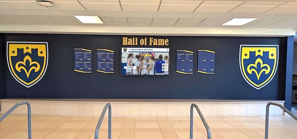
Recognition and Memorial Displays
Digital walls of fame, donor recognition, and memorial displays celebrate individuals and achievements.
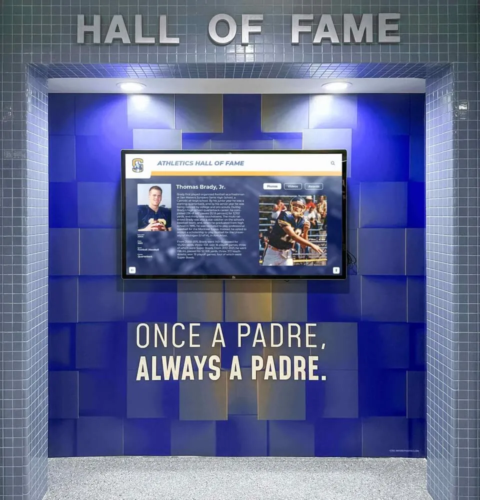
Search-Optimized for Name Discovery
Recognition displays exist primarily to help visitors find specific honorees. Design priorities include prominent search functionality accessible immediately from home screens, auto-suggest accelerating name entry, phonetic search handling varied spellings, and alternative browse options (by year, category, achievement type).
Once users locate desired profiles, detailed biographical content, photographs, and achievement documentation create meaningful tributes that honor recognized individuals appropriately.
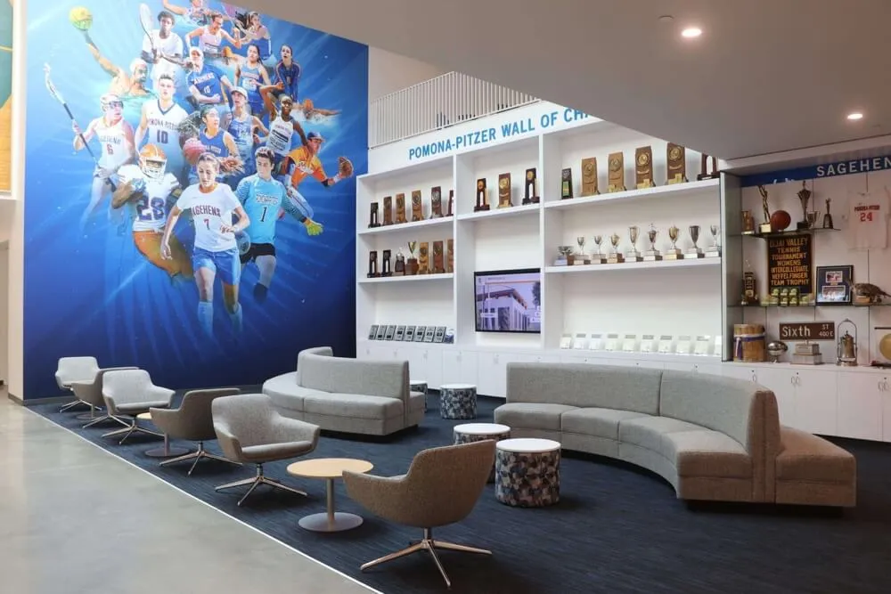
Comprehensive approaches to digital recognition display design demonstrate best practices for celebratory touchscreen content.
Wayfinding and Information Kiosks
Directional kiosks help visitors navigate unfamiliar environments and access service information.
Quick Information Access Priority
Unlike exploratory touchscreens encouraging extended engagement, wayfinding kiosks should get users to needed information as quickly as possible. Design priorities include immediate directory access without navigation, visual maps with highlighted routes to destinations, integration with real-time information (wait times, schedule changes), and clear, bold directional instructions.
Session duration represents inverse success metric for wayfinding—shorter sessions indicate users found information quickly, while extended sessions suggest navigation difficulties or unclear information.
Multi-Language Support
Public wayfinding kiosks serve diverse populations including international visitors and non-English speakers. Comprehensive language support includes prominent language selection on home screens, complete interface translation (not just content), culturally-appropriate iconography and symbols, and right-to-left text support for Arabic, Hebrew, and similar languages.
Machine translation may suffice for rarely-accessed languages, while frequently-needed languages warrant professional human translation ensuring accuracy and cultural appropriateness.
Educational and Museum Exhibits
Interpretive touchscreens enhance learning and exploration in educational contexts.
Storytelling and Narrative Structure
Unlike transactional kiosks, educational touchscreens benefit from narrative structures guiding users through curated journeys. Effective approaches include timeline-based navigation through historical content, thematic organization around big ideas or questions, progressive deepening from overviews to detailed content, and interconnected content enabling exploratory tangents.
Multimedia integration—video, audio, interactive elements—creates engaging learning experiences that static text cannot match.
Age-Appropriate Design
Educational touchscreens often serve diverse age groups requiring different interaction styles. Child-focused designs employ larger targets accommodating less-precise touch, simpler navigation with fewer options, game-like interactions maintaining engagement, and bright, playful aesthetics appealing to young audiences.
Adult educational content can employ more sophisticated navigation, denser information presentation, and subdued professional aesthetics.
Learn effective educational approaches through interactive museum displays engaging diverse visitor demographics.
Corporate and Lobby Displays
Business environment touchscreens require professional polish while serving multiple stakeholder groups.
Brand Consistency and Professional Aesthetics
Corporate touchscreens should reflect organizational brand through consistent use of brand colors and typography, professional photography and visual assets, appropriate tone and messaging alignment, and polished, sophisticated interface design.
These displays represent organizational identity to visitors, clients, and employees—amateurish execution damages institutional credibility.
Multi-Audience Content Structuring
Corporate lobbies host diverse visitors including prospective employees seeking information, clients learning about services, vendors looking for contacts, and internal staff accessing resources.
Effective corporate touchscreens provide clear audience segmentation on home screens, enabling each group to find relevant content quickly without wading through irrelevant information.
Implementation and Launch Strategy
Successful touchscreen deployment requires systematic planning and execution beyond interface design.
Pre-Launch Planning and Preparation
Environmental Assessment
Physical installation contexts dramatically affect touchscreen usability. Critical considerations include ambient lighting and glare—bright windows or harsh overhead lights reduce visibility, requiring displays with high brightness (700+ nits) or anti-glare coatings; traffic patterns and approach angles—displays should face primary traffic flow at comfortable approach angles; ADA accessibility—mounting heights, clear floor space, and reach ranges must comply with regulations; power and networking—reliable electrical and internet connectivity; and physical security—public installations require protected mounting preventing theft or vandalism.
Content Development and Curation
Launch quality depends on initial content comprehensiveness. Before going live, ensure sufficient content volume—recognition displays should include substantial honoree collections, directories should contain complete organizational information, and educational displays should offer meaningful exploration depth.
Content quality standards including professional photography, accurate information verified by subject experts, proper attribution and permissions, and consistent formatting and presentation style.
Staff Training and Support
Even well-designed interfaces occasionally require assistance. Front-line staff benefit from training covering basic touchscreen operation and features, common troubleshooting for typical issues, content update processes for relevant staff, and escalation procedures for technical problems requiring IT support.
Staff who understand touchscreen capabilities can proactively assist visitors while serving as content champions internally.
Launch and Promotion
Soft Launch and Testing Period
Before official announcements, conduct quiet launch periods enabling real-world testing with limited visibility. Soft launches reveal issues that controlled testing missed, validate performance under actual usage conditions, and enable refinements before wider promotion attracts critical attention.
Promotional Strategy
Maximize touchscreen visibility and usage through announcements in organizational communications, guided tours demonstrating capabilities, signage directing visitors to new displays, QR codes linking mobile users to complementary online content, and media coverage for significant installations.
Initial launch excitement generates trial usage; sustained engagement depends on ongoing content quality and promotional efforts highlighting new content regularly.
Feedback Collection Systems
Launch represents opportunity to gather early user feedback while novelty drives engagement. Implement feedback mechanisms immediately including brief intercept surveys, email or web feedback options, analytics tracking to identify usage patterns, and staff observation reports noting visitor reactions.
Early feedback enables rapid iteration addressing issues before they become entrenched problems.
Conclusion: Creating Touchscreen Experiences That Truly Engage
Designing touch screen experiences that genuinely engage users requires holistic thinking extending far beyond making content tappable. Successful implementations combine intuitive interaction design respecting user expectations shaped by mobile devices, compelling content addressing visitor goals and questions, clear visual hierarchy enabling effortless navigation, comprehensive accessibility ensuring usability for all visitors, technical excellence providing responsive, frustration-free operation, and continuous improvement refining experiences based on real usage data.
The principles explored in this guide provide frameworks for touchscreen design that works—interfaces that feel natural, content that rewards exploration, and experiences that visitors genuinely enjoy rather than tolerate out of necessity. From touch target sizing and visual affordances to multimedia storytelling and progressive disclosure, these practices emerge from extensive user research and field-tested implementation across diverse institutional contexts.
Strategic Implementation Pathway
Organizations planning touchscreen deployments should prioritize understanding user needs and goals before technical decisions, selecting content and design approaches matching identified needs, investing in quality content creation and curation, implementing with attention to both design and technical excellence, testing thoroughly with representative users before public launch, measuring engagement and usage systematically after deployment, and refining continuously based on analytics and user feedback.
This user-centered approach ensures touchscreen investments deliver meaningful value rather than becoming expensive digital bulletin boards that fail to generate anticipated engagement.
The Human Element in Interactive Technology
Ultimately, touchscreen success depends on understanding that technology serves human needs—interfaces should feel approachable rather than intimidating, content should inform rather than overwhelm, and interactions should delight rather than frustrate. When touchscreen experiences respect users’ time, accommodate their capabilities, and deliver genuine value through compelling content, they become destinations that visitors seek out rather than obstacles they navigate around.
Solutions like Rocket Alumni Solutions provide comprehensive platforms designed specifically for institutional touchscreen deployments, combining sophisticated content management with user-centered design principles that ensure engaging visitor experiences. Whether celebrating institutional achievements, guiding visitors through facilities, or creating educational exploration opportunities, well-designed touchscreen experiences strengthen connections between organizations and the communities they serve.
Create Engaging Touchscreen Experiences
Discover how thoughtfully designed interactive displays can transform visitor engagement, celebrate achievements, and create memorable experiences that reflect your institutional excellence.
Explore Interactive SolutionsReady to begin? Start with user research understanding what your visitors need from touchscreen experiences, then design interfaces and curate content directly addressing those needs. With clear goals, thoughtful execution, and commitment to continuous improvement, you can create touchscreen experiences that genuinely engage users while serving institutional missions effectively.
Your visitors deserve touchscreen experiences that respect their intelligence, accommodate their capabilities, and deliver real value through quality content and intuitive interaction. With the principles and practices explored in this guide, you can design and implement interactive displays that achieve these goals while elevating your institution’s commitment to accessibility, innovation, and visitor service excellence.
Explore proven approaches to touchscreen kiosk implementation and discover comprehensive digital display solutions serving institutional needs across education, recognition, wayfinding, and public engagement applications.