Donor wall signage represents far more than decorative elements in school lobbies—these recognition displays communicate institutional gratitude, inspire future giving, and create lasting impressions on students, families, and community members who encounter them daily. Yet many schools implement donor recognition that fails to honor contributors effectively due to poor typography choices that reduce readability, inappropriate material selections that degrade quickly, or inadequate visibility planning that renders displays virtually invisible in high-traffic environments.
The difference between donor wall signage that elevates advancement efforts and displays that disappoint donors often comes down to fundamental design decisions made during planning phases: selecting typefaces with appropriate legibility at viewing distances, choosing materials that withstand decades of environmental exposure while maintaining professional appearance, and positioning recognition elements where natural sight lines and lighting conditions maximize visibility rather than obscure donor names in shadows or glare.
Development directors, facility planners, and advancement teams face complex decisions when implementing donor wall signage—navigating recommendations from designers, fabricators, and technology vendors while ensuring final installations honor contributors appropriately, align with architectural contexts, and support long-term stewardship relationships. This comprehensive guide provides practical frameworks for making typography, material, and visibility decisions that create donor recognition displays worthy of the generosity they celebrate.
Creating effective donor wall signage requires balancing aesthetic appeal with functional legibility, institutional permanence with content flexibility, and architectural integration with prominent visibility. Schools that approach these decisions systematically—applying typography principles proven to enhance readability, selecting materials appropriate for environmental conditions, and planning visibility based on traffic patterns and lighting realities—create recognition displays that serve advancement missions effectively while honoring donor relationships with the professionalism contributors deserve.

Effective donor wall signage combines thoughtful typography, appropriate materials, and strategic placement to create impactful recognition displays
Typography Fundamentals for Donor Wall Readability
Typography selections fundamentally determine whether donor names are easily readable from typical viewing distances or require visitors to approach within inches to decipher poorly designed letterforms. Schools must evaluate typeface characteristics, sizing relationships, and spacing decisions that collectively impact readability.
Selecting Appropriate Typefaces for Donor Recognition
Serif vs. Sans-Serif Considerations
Traditional donor walls often employ serif typefaces—fonts featuring small decorative strokes at letter endings—based on assumptions about formality and institutional dignity. Research from typographic studies demonstrates that sans-serif fonts (typefaces without decorative strokes) generally provide superior legibility for environmental signage applications, particularly at distances exceeding six feet. Sans-serif letterforms feature cleaner visual structures with fewer decorative elements that can blur together when viewed from typical lobby distances.
However, typeface selection should consider architectural context and institutional branding. Classical campus buildings with traditional architecture may warrant serif typefaces that harmonize with surrounding design vocabularies, while contemporary facilities often benefit from clean sans-serif fonts that complement modern aesthetic languages. The key criterion remains legibility—whatever typeface schools select must render donor names clearly readable at intended viewing distances rather than sacrificing functionality for stylistic preferences.
Avoiding Decorative and Script Fonts
One of the most common typography mistakes in donor wall signage involves selecting ornamental script fonts or highly decorative typefaces that severely compromise readability. Fonts featuring elaborate flourishes, extreme stroke weight variations, or script letterforms that connect characters create beautiful close-viewing effects but become illegible when scaled to wall-mounted applications viewed from 10-20 feet away.
Development teams should test typography selections by printing donor names at actual sizes and viewing them from realistic distances within installation environments. If any names prove difficult to read quickly and clearly, the typeface fails the fundamental legibility test regardless of aesthetic appeal in design presentations.
Weight and Contrast Specifications
Font weight—the thickness of letterform strokes—dramatically impacts visibility and readability. Light-weight fonts with thin strokes disappear against backgrounds, particularly in low-contrast color combinations. Medium to bold font weights provide appropriate visual presence for donor recognition applications without appearing overly heavy or aggressive.
Color contrast between typography and background surfaces must meet accessibility standards ensuring readability for visitors with varying visual acuity. High-contrast combinations—dark text on light backgrounds or light text on dark backgrounds—provide optimal legibility. Mid-tone text on mid-tone backgrounds creates visibility challenges even when theoretical contrast ratios meet minimum standards.

Typography selections should prioritize readability while maintaining visual harmony with architectural surroundings
Sizing and Spacing for Optimal Legibility
Calculating Appropriate Letter Heights
Typography sizing for donor wall signage follows practical formulas based on viewing distances. General guidelines recommend letter heights of one inch per ten feet of viewing distance as minimum specifications. For lobby displays viewed primarily from 15-20 feet, donor names should feature letter heights of at least 1.5-2 inches to ensure comfortable readability without requiring visitors to approach closely.
Hierarchical information requires differentiated sizing: primary donor names might use 2-inch letter heights, while secondary information (graduation years, giving levels, campaign names) could employ 1-1.25 inch typography. This sizing differentiation creates clear visual hierarchies that guide viewer attention while maintaining legibility across information levels.
Line Spacing and Tracking Adjustments
Adequate spacing between donor names proves as important as letter sizing for readability. Cramped line spacing (leading) causes names to blur together visually, creating dense text blocks that discourage reading and make locating specific donors difficult. Minimum line spacing should equal 120-150% of letter height—for 2-inch letters, this requires 2.4-3 inches between baseline positions of successive lines.
Letter spacing (tracking) within donor names affects readability particularly for all-capitals text commonly used in recognition displays. Slight positive tracking—adding small amounts of space between letters—improves legibility for uppercase typography while maintaining visual cohesion. However, excessive tracking creates disconnected letterforms that slow reading comprehension.
Material Selection for Durability and Visual Impact
Material choices determine how donor wall signage ages over decades, maintains professional appearance despite environmental exposure, and communicates quality commensurate with donor contributions. Schools must evaluate performance characteristics alongside aesthetic considerations.
Traditional Material Options and Performance
Metal Plates and Plaques
Bronze, brass, aluminum, and stainless steel have served donor recognition applications for generations, offering distinct advantages in permanence and perceived value. Bronze develops natural patina over time that many institutions appreciate for adding historical character, though some donors prefer the maintained appearance requiring periodic polishing. Anodized aluminum provides excellent durability with color-stable finishes that resist fading and corrosion, making it ideal for both interior and exterior applications.
Metal fabrication allows various finishes from polished mirror surfaces to brushed satins and textured patterns. Engraved or etched lettering creates permanent donor records resistant to wear and vandalism. However, metal solutions require upfront decisions about donor names, making future additions difficult without visible inconsistencies as metal finishes age differently over time.
Acrylic and Glass Systems
Laser-engraved acrylic offers modern aesthetics with excellent clarity, light transmission properties enabling backlighting effects, and more affordable pricing compared to metal alternatives. Acrylic maintains color stability and resists yellowing when quality materials are specified, though scratching remains a concern in high-traffic environments.
Glass recognition systems provide premium aesthetics with exceptional clarity and scratch resistance. Sandblasted, acid-etched, or digitally printed glass creates elegant donor displays particularly suited to contemporary architectural contexts. The fragility and weight of glass require robust mounting systems and careful installation planning.
Wood and Composite Materials
Traditional wood plaques continue serving institutional recognition applications, particularly in settings where natural materials complement architectural character. Hardwoods like walnut, cherry, and oak provide beautiful grain patterns and warm aesthetic qualities. However, wood requires environmental control to prevent warping, cracking, or fading from UV exposure and humidity variations.
For institutions exploring donor recognition display ideas that balance traditional aesthetics with contemporary functionality, understanding material performance characteristics guides appropriate selections for specific environments and maintenance capabilities.

Material selections should balance aesthetic appeal with long-term durability and maintenance requirements
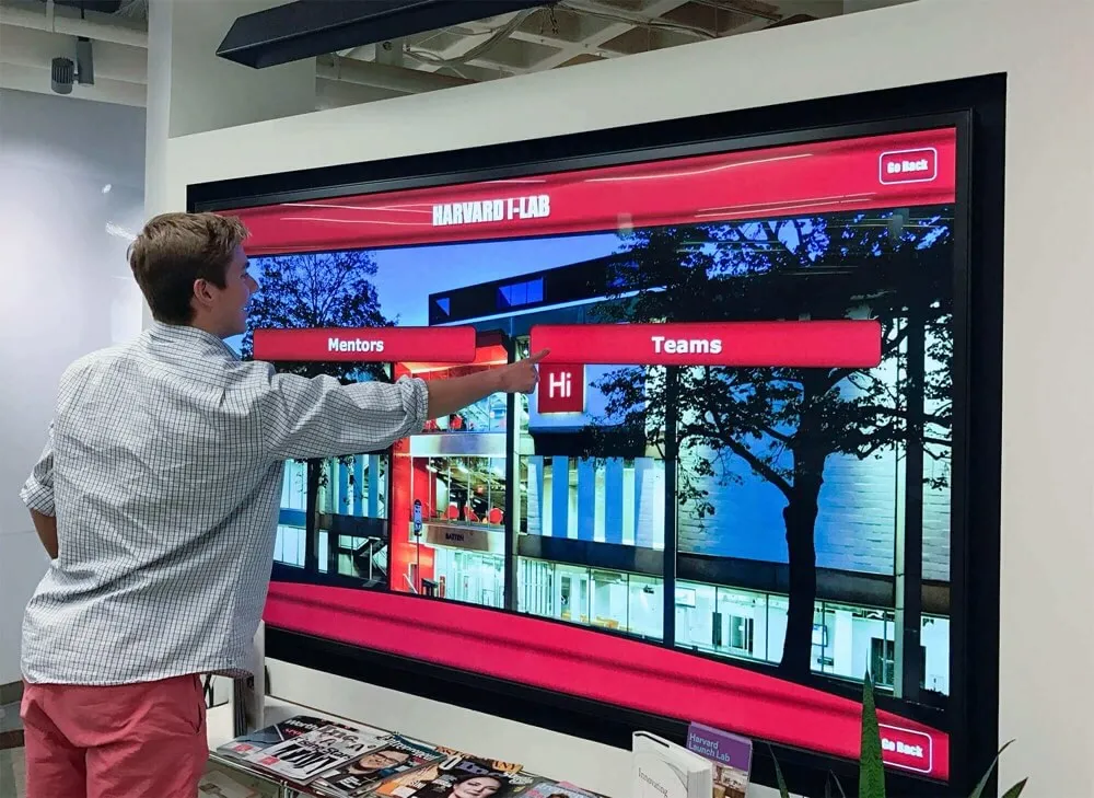
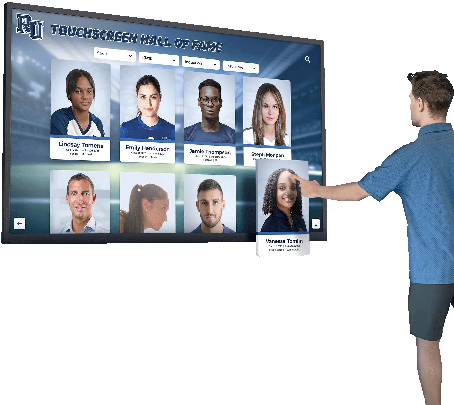
Digital Display Technology as Modern Alternative
Dynamic Content Capabilities
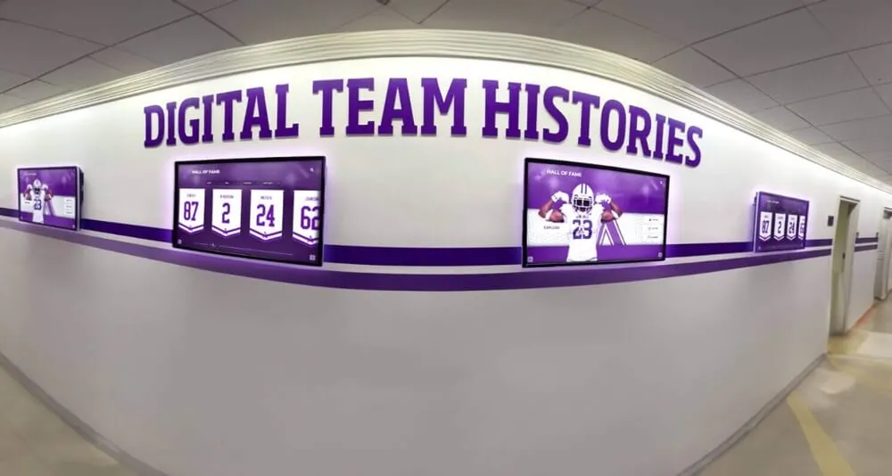
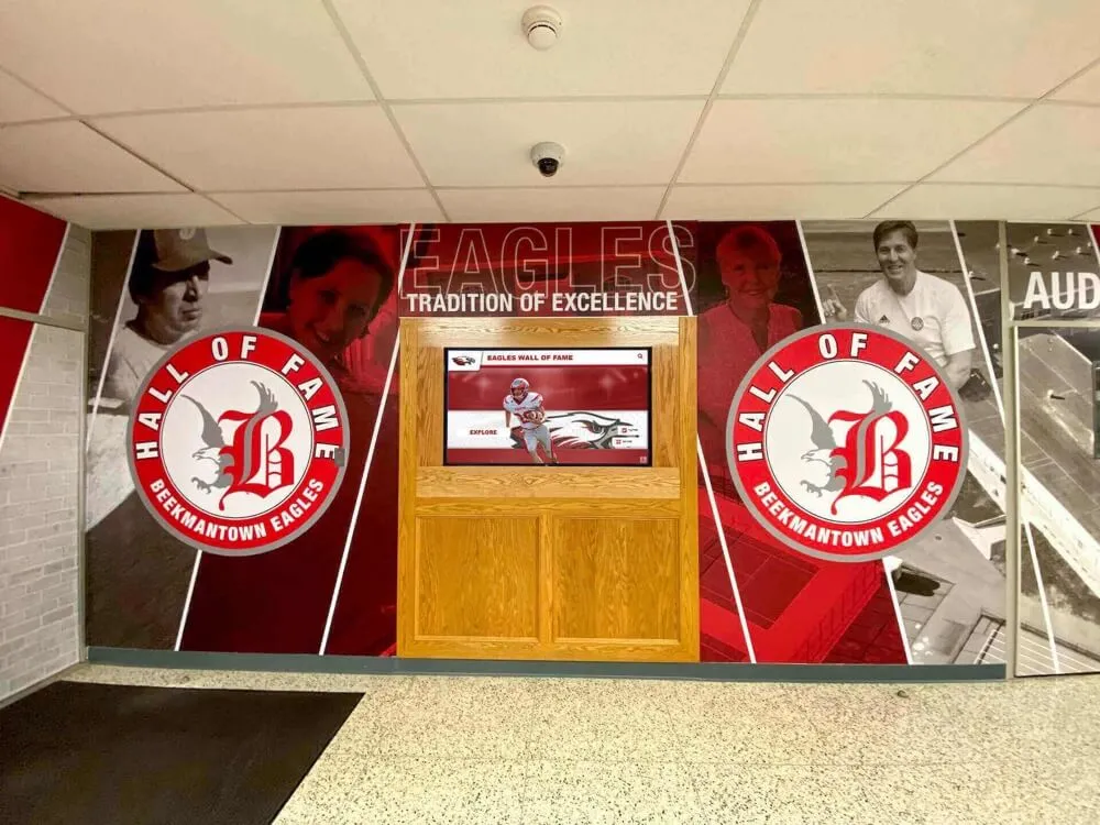
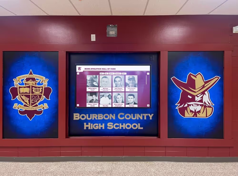
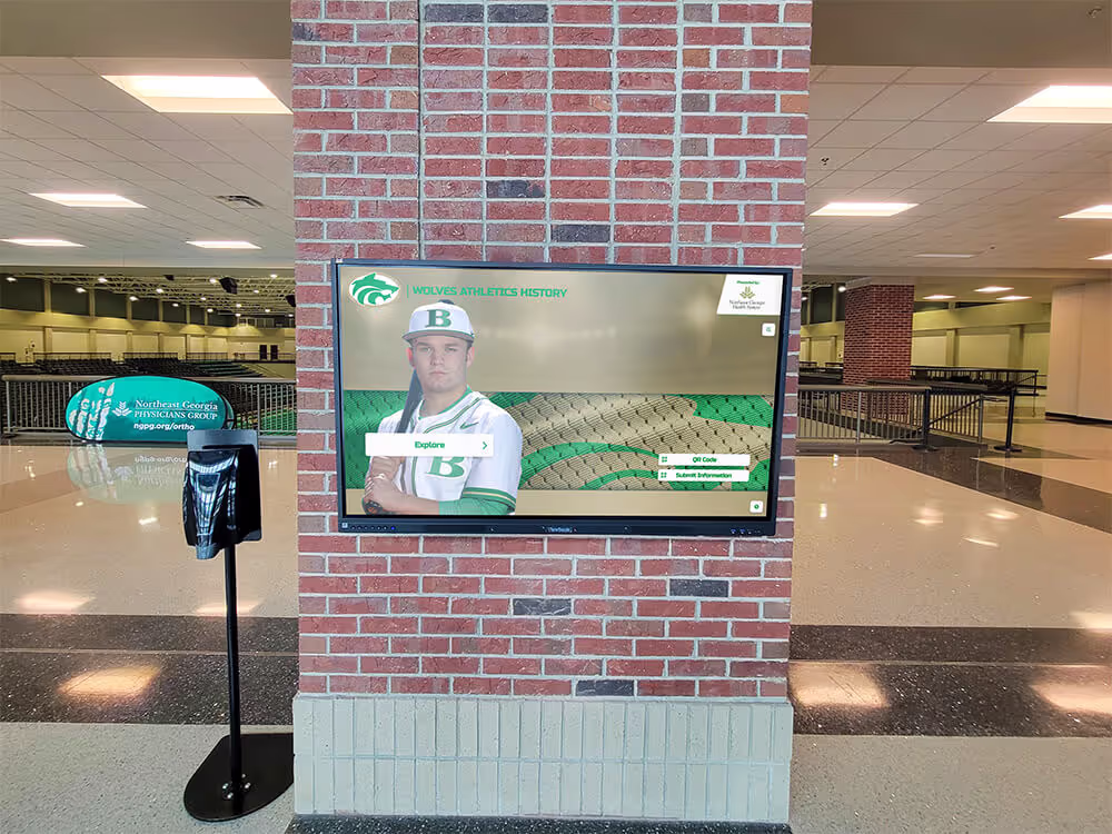
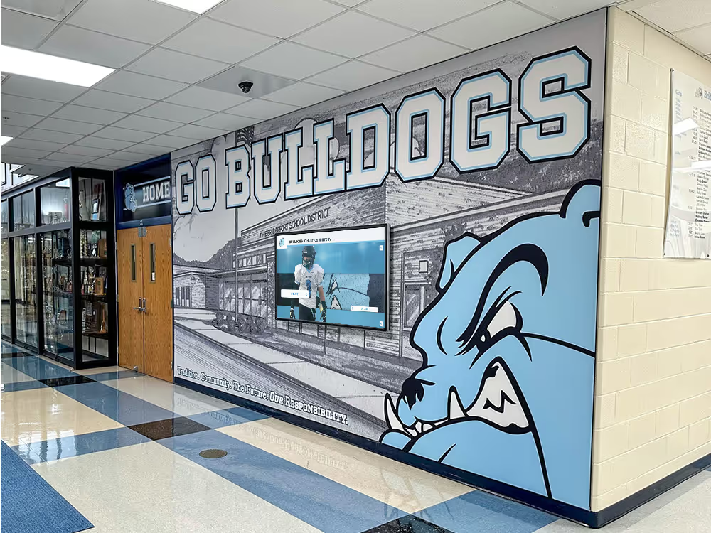
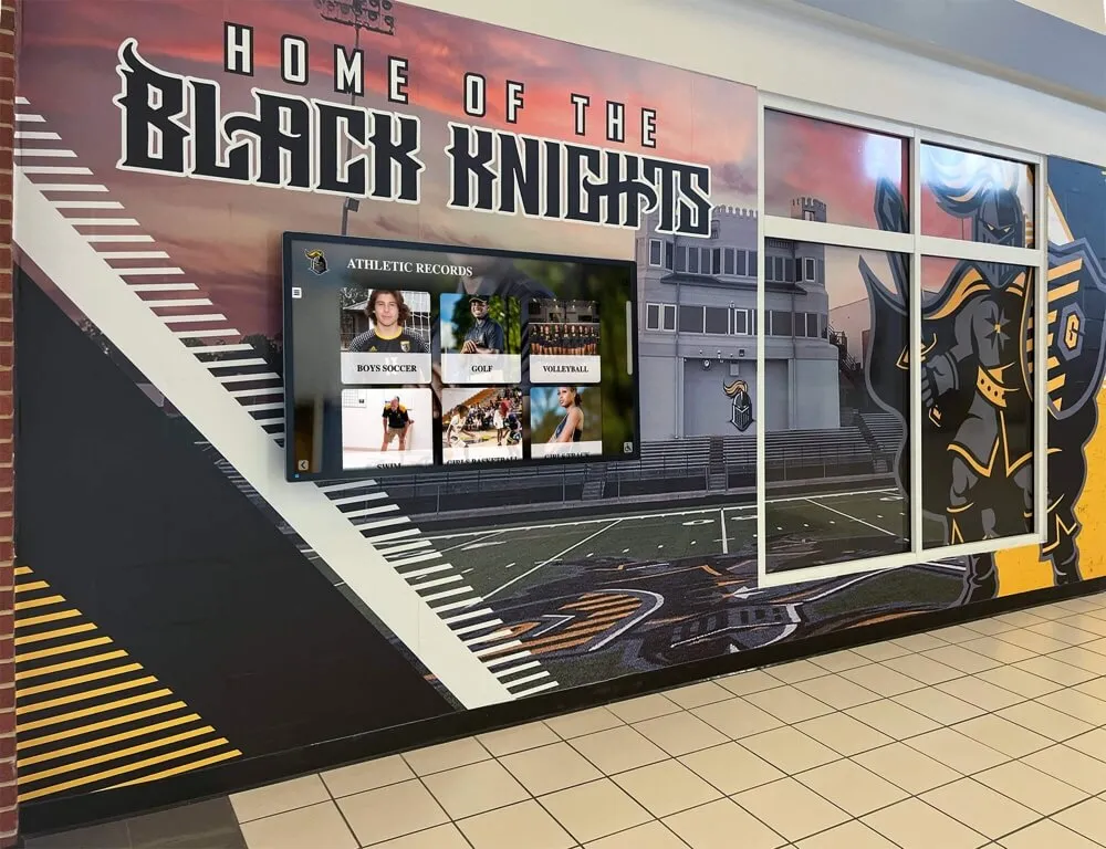
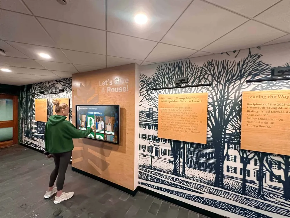
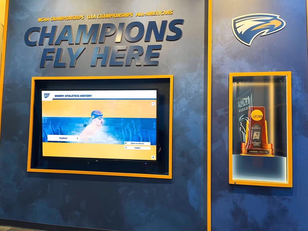
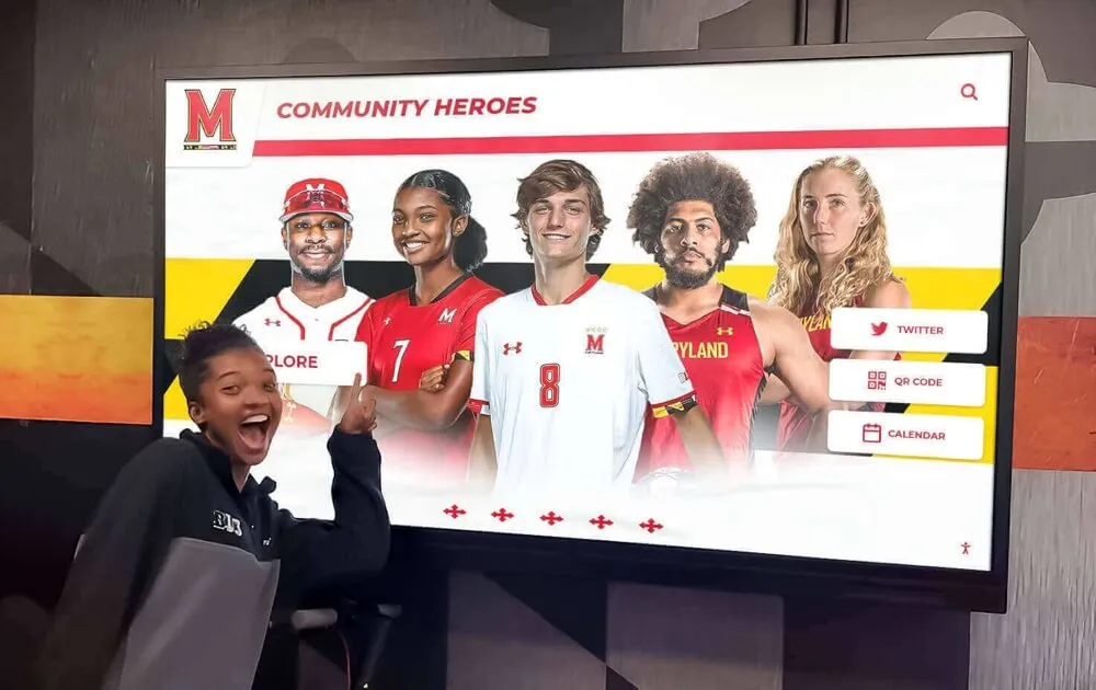
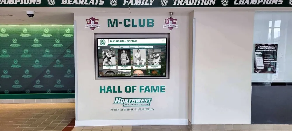
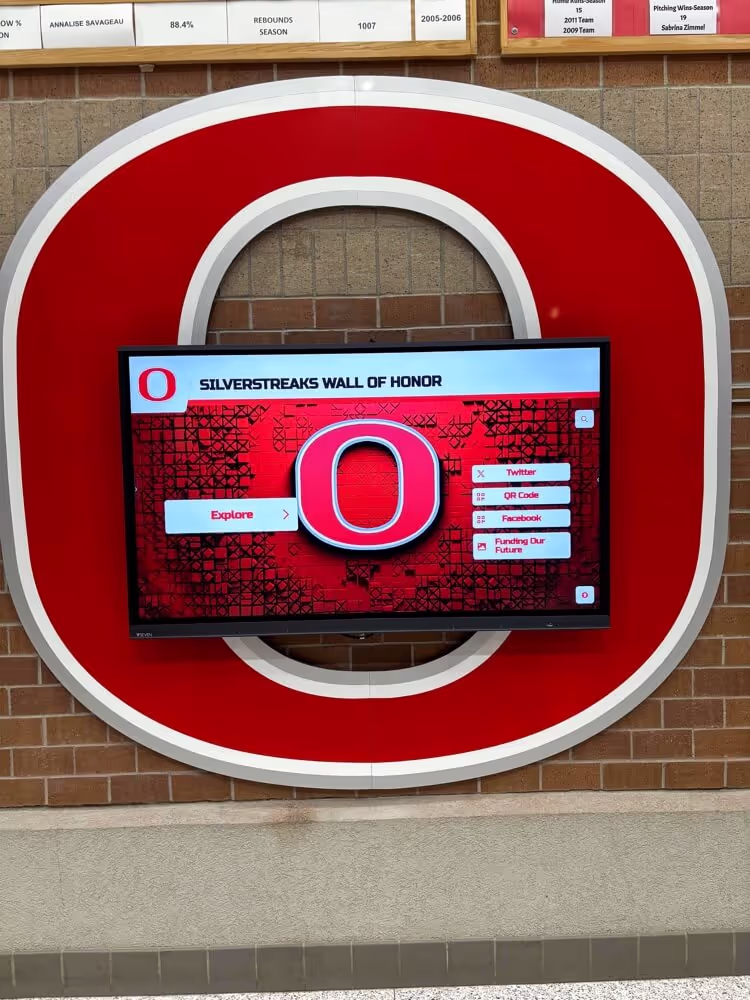
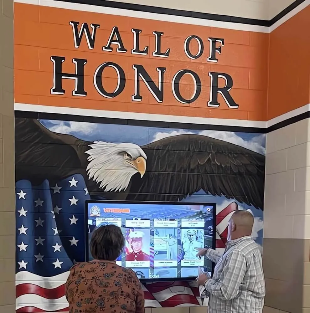
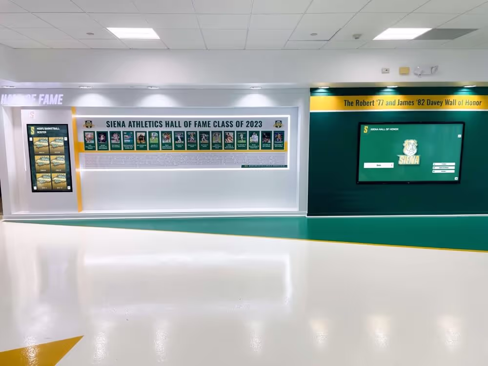
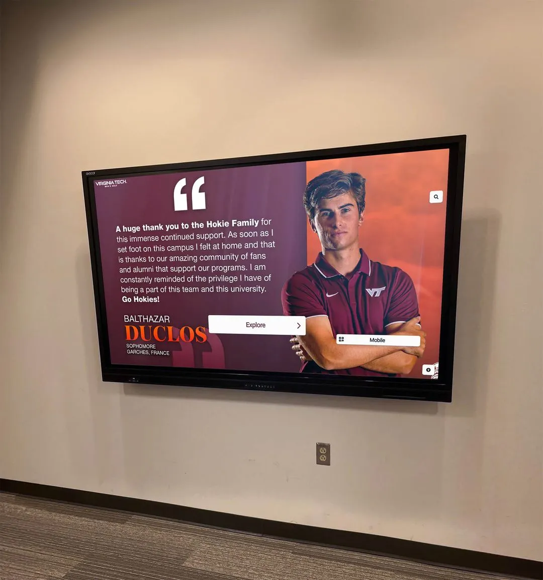
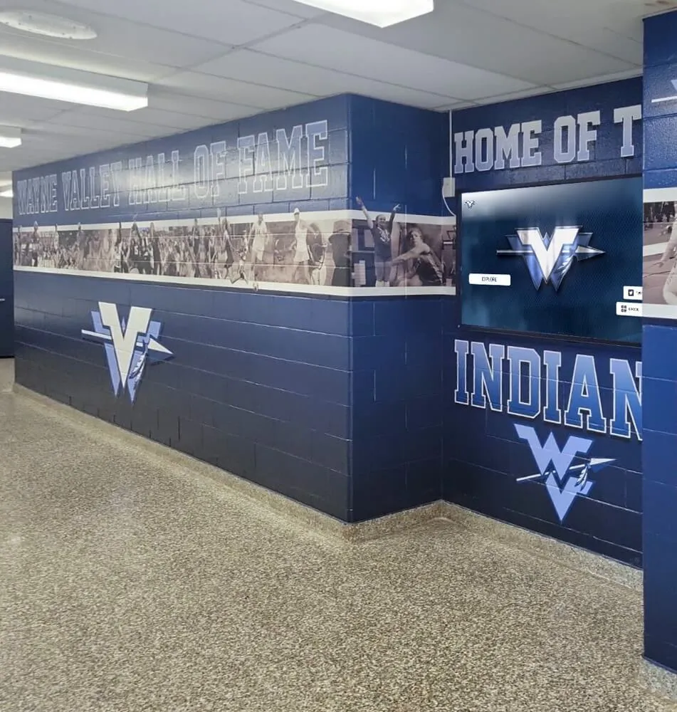
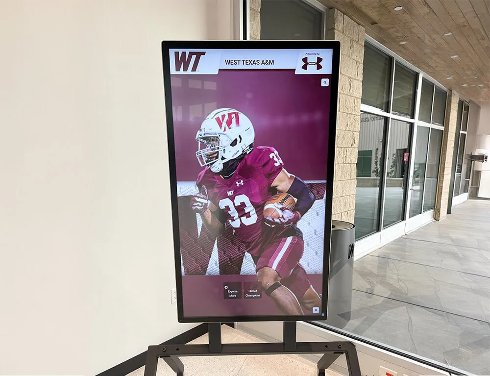
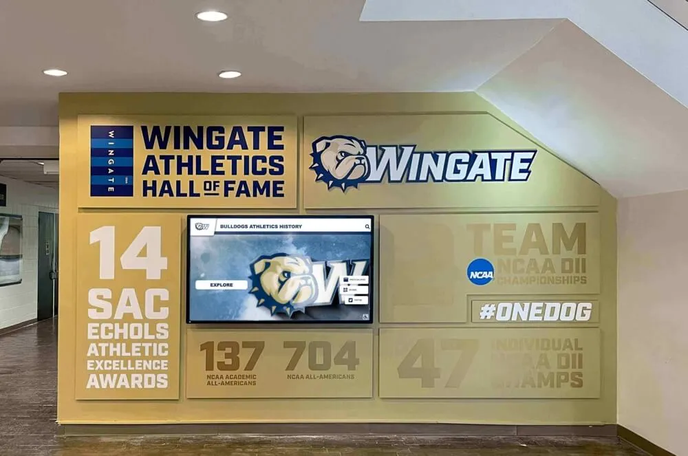
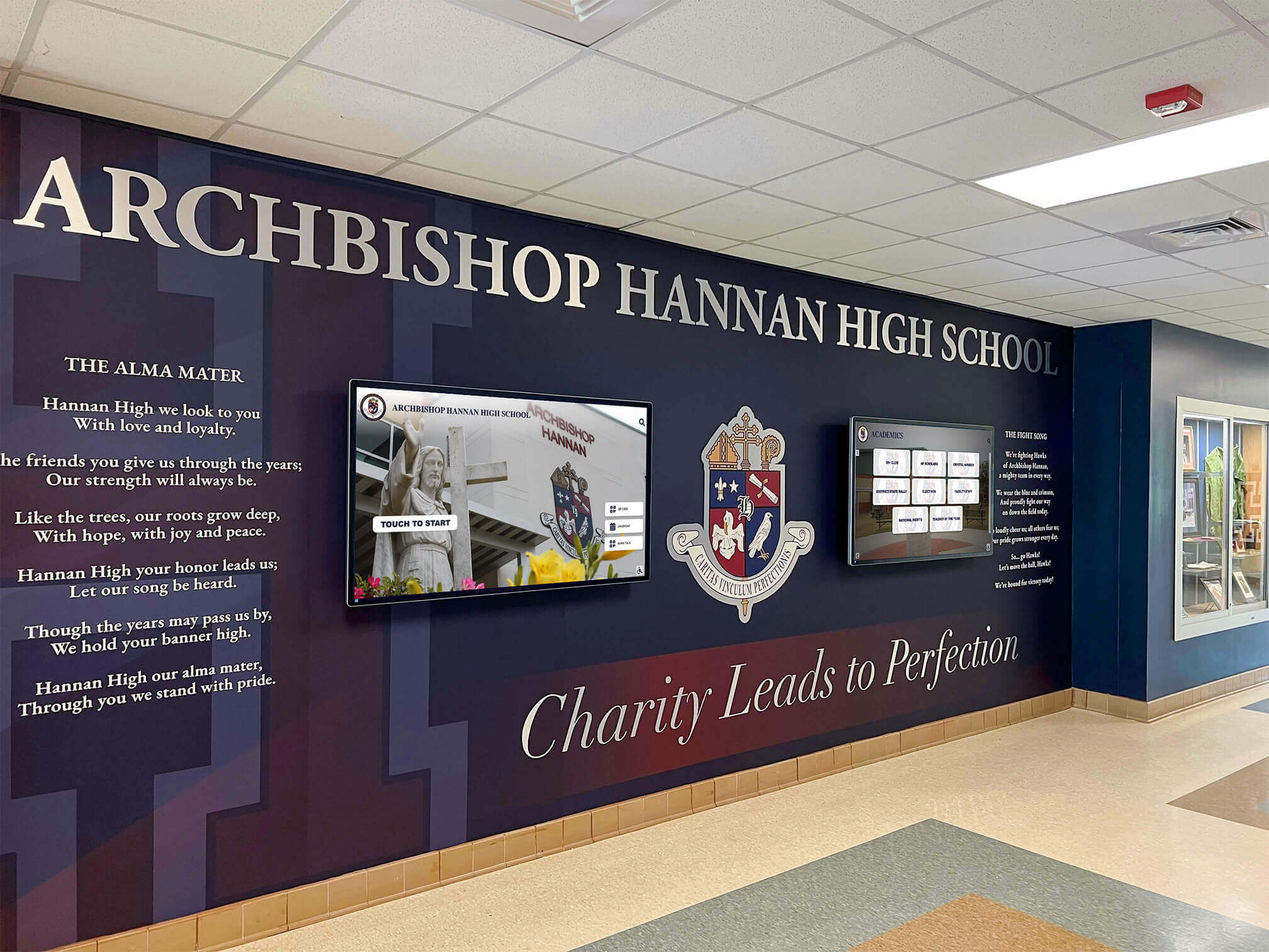
Digital donor recognition displays represent fundamental shifts from permanent static signage to flexible systems accommodating campaign evolution, donor additions, and recognition updates without fabrication delays or visible patches. High-resolution screens enable sophisticated presentations including donor portraits, campaign progress visualizations, giving level tiers, and narrative content explaining philanthropic impact—content impossible to convey through traditional plaques.
Digital systems eliminate the visual inconsistency problems plaguing traditional donor walls where new names added years after initial installation appear different from original recognition as materials age differently. Every donor name on digital displays receives identical treatment regardless of contribution timing, eliminating the “patchwork” appearance common on expanded traditional walls.
Flexibility for Campaign Updates
Capital campaigns typically unfold over multiple years with donor commitments confirmed at various stages. Traditional signage requires uncomfortable decisions about when to fabricate recognition displays—too early and many names remain missing, too late and early donors wait years for promised recognition. Digital platforms resolve this timing challenge through instant updates as new commitments are confirmed, ensuring all donors receive timely recognition supporting stewardship relationships.
Giving level adjustments, naming right changes, and donor preference updates that require expensive metal plaque replacements become simple content updates on digital systems. This operational flexibility proves particularly valuable during active campaigns where donor information changes frequently.
Integration with Advancement Data
Sophisticated digital donor wall platforms integrate with advancement databases, automatically updating recognition displays as gift records are processed. This integration eliminates manual double-entry processes while ensuring donor information accuracy across all recognition touchpoints.
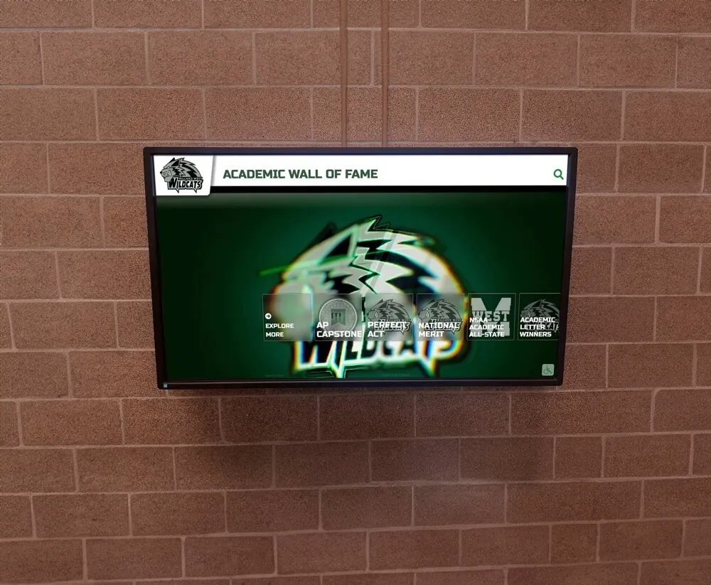
Schools implementing digital recognition often discover additional applications beyond donor walls—the same platforms can showcase art class gallery displays, academic achievements, and community recognition programs, maximizing technology investments.
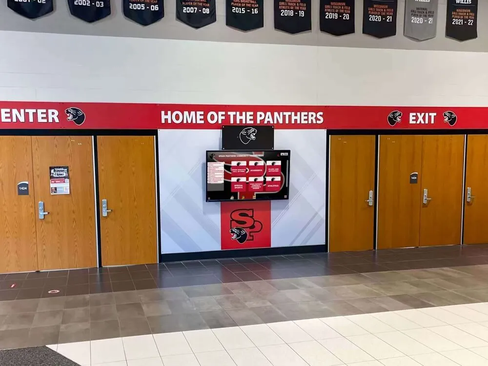
Strategic Visibility Planning for Maximum Impact
Even beautifully designed donor wall signage fails advancement objectives when positioned where architectural features, lighting conditions, or traffic patterns prevent visibility. Schools must approach placement decisions systematically.
Analyzing Traffic Patterns and Sight Lines
Primary vs. Secondary Circulation Routes
Not all lobby locations offer equal visibility despite appearing prominent in floor plans. Primary circulation routes—pathways most visitors naturally traverse between building entrances and destinations—provide far superior recognition opportunities compared to secondary locations that receive traffic only from specific building areas.
Advancement teams should conduct observational studies documenting traffic patterns during various times and events: typical school days, evening programs, weekend activities, and special events. These observations reveal actual pedestrian flows rather than assumed patterns, identifying locations where thousands of viewers naturally pass daily versus spaces that appear prominent but receive minimal traffic.
Optimal Viewing Angles and Distances
Human sight lines follow predictable patterns as people move through spaces—most individuals look straight ahead or slightly downward rather than dramatically upward or to extreme peripheral angles. Donor wall signage positioned outside natural sight line cones—requiring visitors to look sharply upward, turn completely around, or search peripheral locations—sacrifices visibility regardless of design quality.
Vertical positioning deserves particular attention. Recognition displays mounted too high force uncomfortable upward viewing angles while appearing visually distant and disconnected from visitors. Optimal positioning places primary donor information at 48-72 inches above floor level—heights aligning with natural sight lines for both standing and seated viewers.
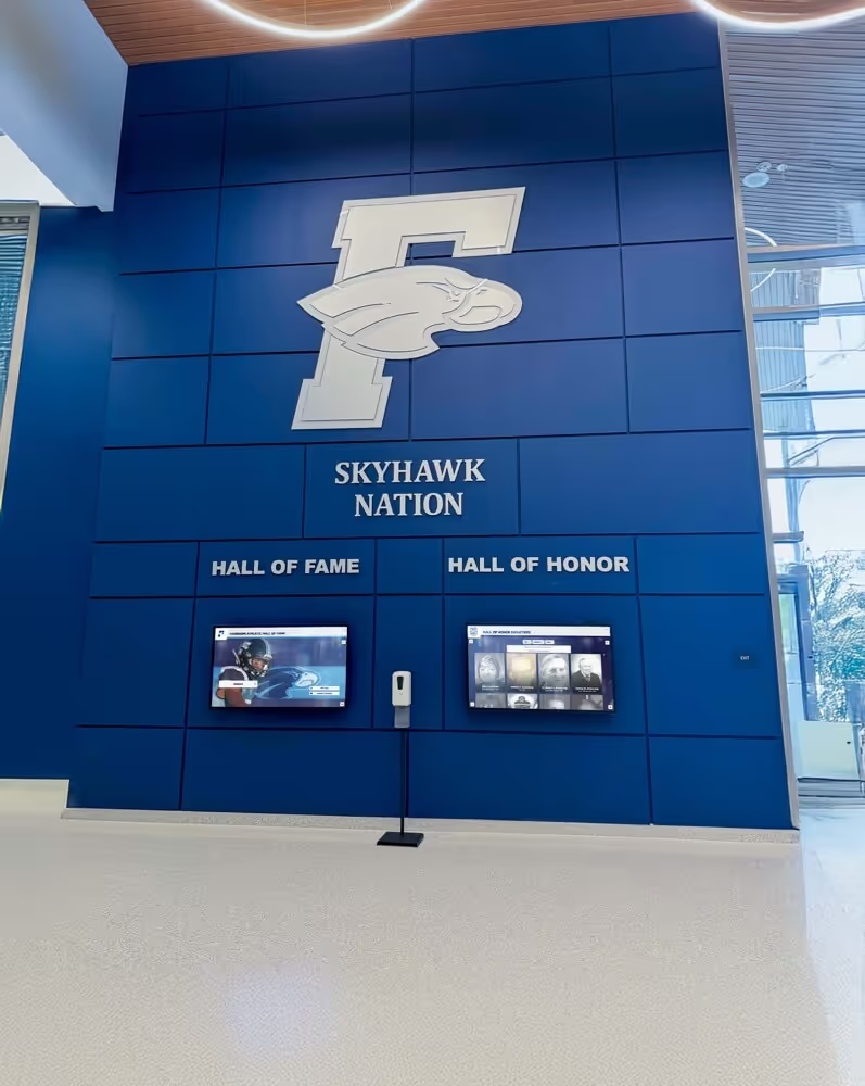
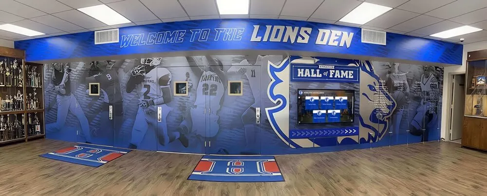
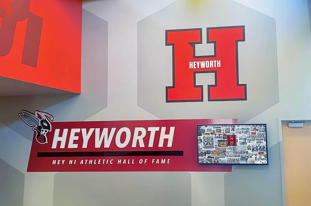
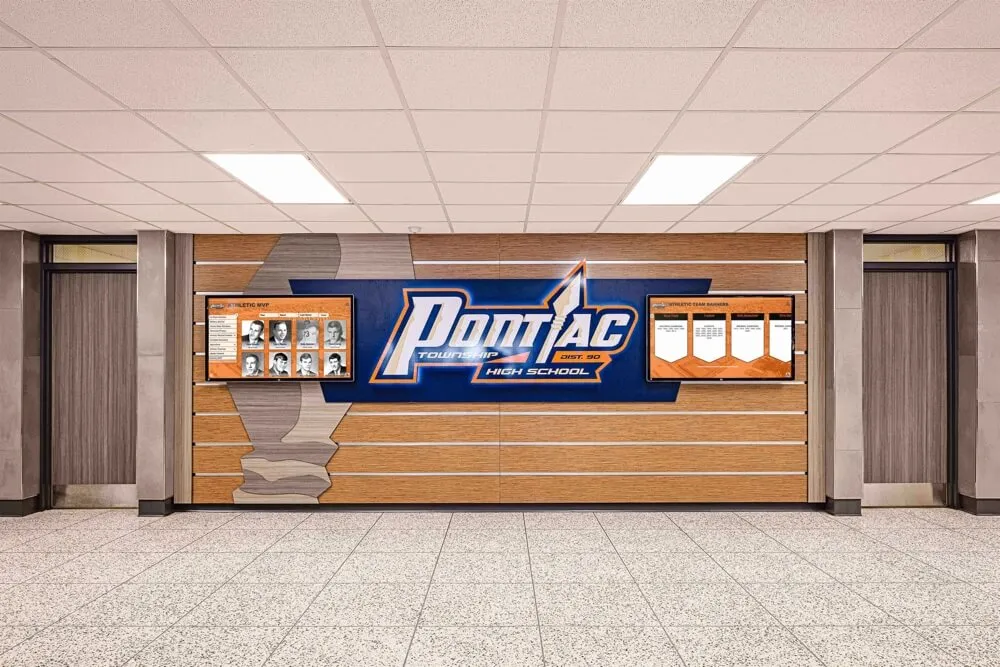
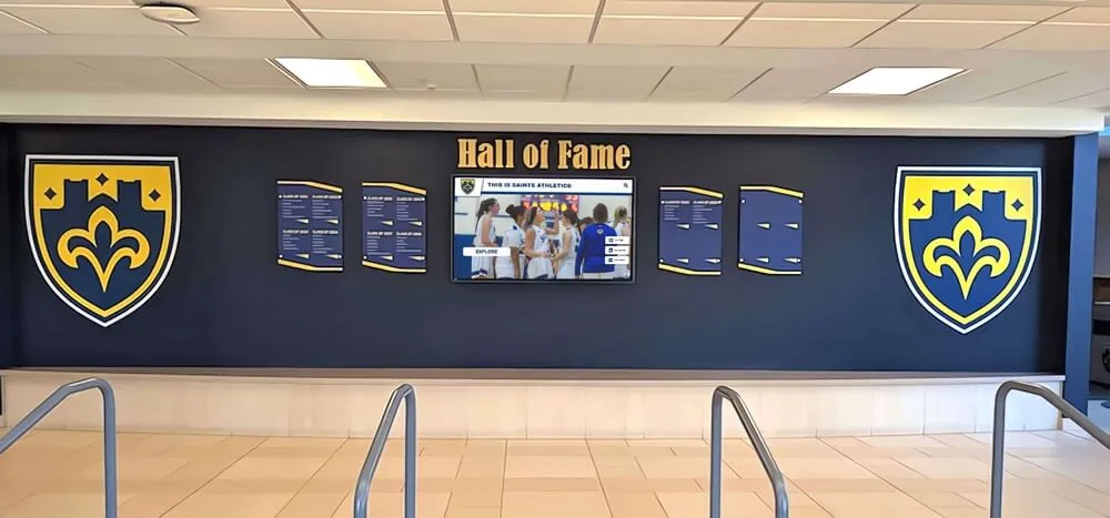
Creating Dedicated Recognition Zones
The most successful donor recognition installations create dedicated zones that clearly communicate purpose and invite engagement rather than competing with wayfinding signage, announcements, trophy cases, and other lobby elements. Defined recognition areas—delineated through architectural features, lighting, materials, or spatial organization—signal importance while providing focused environments where donors receive appropriate prominence.

Creating dedicated recognition zones ensures donor walls receive appropriate attention and visual prominence
Lighting Considerations for Readability
Natural Light Challenges
Lobby locations featuring extensive windows provide appealing brightness but create significant challenges for donor wall signage visibility. Direct sunlight causes severe glare on reflective materials like polished metal or glass, rendering text illegible during certain times of day. Backlighting effects when donor walls are positioned opposite windows create dark silhouettes impossible to read.
Schools must evaluate lighting conditions throughout full day cycles and seasonal variations before finalizing donor wall locations. Recognition displays positioned where western exposure creates intense afternoon glare may be perfectly readable during morning hours but completely illegible when afternoon sunlight strikes surfaces directly.
Artificial Lighting Design
Purpose-designed accent lighting transforms donor wall visibility, drawing attention while ensuring consistent illumination regardless of natural light variations. Track lighting, recessed fixtures, or integrated LED systems can highlight recognition displays, creating focal points within lobbies while providing controlled lighting intensities that eliminate shadows and glare.
Lighting color temperature affects perceived material appearance and text legibility. Warm white lighting (2700-3000K) creates traditional, formal atmospheres while cool white (4000-5000K) provides crisper illumination with enhanced text contrast. Schools should test lighting on actual material samples before finalizing specifications to ensure desired visual effects.
Glare Prevention Strategies
Reflective materials that appear elegant in design samples often create frustrating glare problems in installations. Matte or satin finishes generally perform better than mirror polishes for donor wall applications in environments with variable lighting. For digital displays, anti-glare screen treatments and optimized brightness calibration ensure readability in bright ambient conditions.
Positioning donor walls perpendicular to rather than directly opposite major light sources reduces glare while maintaining adequate illumination for comfortable reading. When architectural constraints limit positioning options, louvers, baffles, or surface angle adjustments can minimize reflections.
Designing Information Hierarchy for Donor Recognition
Effective donor wall signage organizes information hierarchically, guiding viewer attention through visual structures that honor all contributors appropriately while communicating campaign narratives and institutional gratitude clearly.
Organizing Donor Categories and Giving Levels
Visual Differentiation Strategies
Most campaigns feature tiered giving structures with donors at various contribution levels. Recognition displays must honor all donors while appropriately differentiating major benefactors from smaller contributors. Visual hierarchy tools including sizing, positioning, typography weight, color, and spacing create clear distinctions without diminishing any donor’s importance.
Top-level donors might receive larger typography, prominent positioning, additional information (portraits, quotes, campaign impact narratives), and enhanced visual treatments. Mid-level donors appear in slightly smaller but still prominently readable sizing with organized groupings by giving level. All donors, regardless of contribution size, should receive clean, professional presentation that communicates appreciation.
Alphabetical vs. Hierarchical Organization
Advancement teams face decisions about organizing donor names—alphabetically, by giving level, chronologically, or through hybrid approaches. Each strategy communicates different priorities and creates distinct experiences:
Alphabetical organization treats all donors equally regardless of gift size, simplifying name searches while avoiding potential perceptions of favoritism. However, this approach makes recognizing giving level hierarchies less obvious and can scatter related donors across distant alphabet sections.
Hierarchical organization by giving level clearly communicates campaign structure and donor tiers, potentially inspiring additional giving while honoring major benefactors prominently. This approach requires careful design ensuring all levels receive appropriate dignity without creating perceived hierarchies that diminish smaller donors.
Chronological approaches that recognize donors by gift timing can acknowledge campaign pioneers and early supporters, though this strategy works best when combined with giving level indicators to provide complete context.

Information hierarchy design ensures all donors receive appropriate recognition while maintaining clear organizational structure
Including Campaign Context and Impact Messaging
Explaining the “Why” Behind Giving
Donor walls that simply list names without context miss opportunities to inspire future philanthropy and educate community members about campaign impact. Including brief narrative content explaining what donor support accomplished—new facilities, endowed programs, scholarship funds, equipment acquisitions—transforms recognition displays from lists into stories about community investment and institutional mission advancement.
Campaign impact messaging need not overwhelm individual donor recognition—concise statements, statistics, or before-and-after visuals can communicate transformation while maintaining focus on contributor acknowledgment.
Recognition Permanence and Future Flexibility
Traditional static donor walls create permanent records frozen at installation moments, making subsequent additions visually inconsistent as materials age. This permanence-flexibility tension challenges advancement teams who must honor current donors while planning for campaign continuation and future contributors.
Digital donor recognition platforms resolve this challenge through unlimited capacity for donor additions, consistent presentation regardless of contribution timing, and content flexibility supporting campaign evolution. Schools can launch recognition displays immediately as campaigns begin, adding donors as commitments are confirmed rather than waiting until campaigns conclude—providing timely appreciation that strengthens stewardship relationships.
Organizations exploring modern recognition approaches should consider hall of fame tools that offer both donor recognition capabilities and broader institutional storytelling functions.
Accessibility and Inclusive Design Principles
Donor wall signage must serve all community members effectively, including visitors with visual impairments, mobility limitations, or other accessibility considerations that impact how individuals interact with recognition displays.
ADA Compliance Requirements
Mounting Height and Reach Range Specifications
The Americans with Disabilities Act establishes standards for mounted signage ensuring accessibility for wheelchair users and individuals with varying heights. Primary informational elements should be positioned within 48-80 inches above floor level for optimal visibility and reach. When donor walls extend beyond these ranges, the most critical information—primary donor names and key campaign details—should appear within accessible heights.
Protruding elements cannot extend more than four inches from walls when mounted between 27-80 inches above floors without providing detectable warnings for individuals with visual impairments who use canes. This constraint affects dimensional letter applications, decorative features, and interactive element positioning.
Tactile and Audio Accommodation
For visitors with visual impairments, traditional donor walls provide virtually no access to recognition information. Braille translations, raised letterforms, and audio description systems can make donor recognition inclusive for all visitors. Digital recognition platforms offer particular advantages through screen reader compatibility, text-to-speech functionality, and adjustable text sizing that accommodates varying visual acuity.
Schools committed to truly inclusive recognition should consider these accessibility features during planning phases rather than attempting to retrofit them after installations are complete—proactive universal design proves more effective and cost-efficient than reactive modifications.
Universal Design Considerations
Multilingual Recognition Options
Schools serving diverse communities where families speak multiple languages should consider multilingual donor recognition that honors all contributors in languages reflecting community demographics. Digital platforms enable language-switching functionality, presenting identical donor information in multiple languages without requiring separate physical installations.
Color Contrast and Visual Clarity
Color choices must provide sufficient contrast for visitors with various forms of color blindness or low vision. Relying solely on color coding to differentiate giving levels or donor categories excludes individuals who cannot perceive certain color combinations. Combining color with additional visual differentiators—sizing, positioning, typography weight, or symbols—ensures information accessibility regardless of color perception.
High-contrast combinations meeting WCAG guidelines (minimum 4.5:1 contrast ratio for normal text, 3:1 for large text) ensure readability for visitors with reduced visual acuity while improving overall legibility for all viewers.

Accessible donor recognition ensures all community members can engage with displays regardless of physical capabilities
Maintenance, Updates, and Long-Term Stewardship
Donor wall signage represents long-term institutional commitments requiring ongoing maintenance, periodic updates, and careful stewardship to preserve professional appearance and donor relationships.
Planning for Donor Additions and Changes
Traditional Wall Expansion Challenges
Fixed-capacity traditional donor walls create difficult situations when campaigns exceed expectations, additional giving levels are created, or long-running programs accumulate more donors than originally anticipated. Physical space limitations force uncomfortable decisions: cramming additional names into insufficient space, refusing new donor additions, or undertaking expensive expansions that disrupt existing recognition aesthetics.
Donor name changes due to marriage, divorce, or personal preference, memorial conversions when donors pass away, and giving level adjustments as donors increase commitments all require physical modifications to traditional signage. These changes involve fabrication delays, potential mismatches with original materials as finishes age, and costs that accumulate over decades.
Digital Platform Scalability
Modern digital donor recognition platforms eliminate capacity constraints through unlimited donor entries, instant updates without fabrication requirements, and consistent presentation regardless of when donors are added. Campaign evolution, giving level structure changes, and donor information updates become simple content management tasks rather than complex fabrication projects.
This operational flexibility proves particularly valuable during multi-year campaigns where donor commitments arrive throughout extended timelines. Digital systems enable immediate recognition supporting timely stewardship rather than multi-month waits for fabricated additions.
Material Degradation and Preservation
Environmental Factors Affecting Longevity
Different materials age distinctly based on environmental exposures. Metal finishes oxidize, patina, or corrode depending on humidity levels and air quality. Wood warps or fades with temperature and moisture variations. Acrylic yellows under UV exposure unless quality materials with UV inhibitors are specified. Even durable materials deteriorate without appropriate environmental controls.
Schools must consider lobby conditions realistically—are temperatures and humidity controlled year-round, do large windows create intense UV exposure, do cleaning protocols use harsh chemicals that damage finishes? Material selections should match environmental realities rather than idealized conditions.
Cleaning and Restoration Protocols
Establishing clear maintenance protocols from installation prevents damage from inappropriate cleaning methods. Different materials require specific cleaning approaches—what safely cleans bronze may damage acrylic, glass cleaning solutions can harm certain metal finishes, and abrasive methods create permanent damage to many surfaces.
Regular professional maintenance preserves appearance and prevents minor issues from developing into expensive restoration needs. Annual inspections, periodic deep cleaning, and prompt attention to any damage ensure donor walls continue honoring contributors with professional presentation befitting their generosity.
Similar considerations apply to programs recognizing achievements alongside donations, such as most improved awards that often share display space with donor recognition in educational institutions.
Conclusion: Creating Donor Recognition Worthy of Generosity
Effective donor wall signage honors philanthropic commitments through design excellence, material quality, and visibility planning that communicates institutional gratitude professionally and permanently. Typography selections that prioritize readability, materials chosen for environmental appropriateness and longevity, and strategic placement maximizing visibility collectively determine whether recognition displays strengthen donor relationships or disappoint contributors who deserve better.
Schools face critical decisions between traditional permanent signage offering historical gravitas and modern digital platforms providing operational flexibility. Traditional approaches serve institutions well when donor populations are stable, campaigns have defined endpoints, and architectural contexts warrant permanent materials. Digital solutions excel for ongoing recognition programs, multi-year campaigns with evolving donor rosters, and institutions seeking flexibility to adjust recognition as advancement strategies evolve.
The most successful donor recognition installations share common characteristics: typography that remains clearly legible from realistic viewing distances, materials selected for appropriate environmental performance, placement within natural traffic patterns and sight lines, lighting ensuring consistent visibility, information hierarchies that honor all donors appropriately, accessibility features serving all community members, and maintenance planning supporting long-term appearance preservation.
Whether implementing traditional signage or digital recognition platforms, advancement teams should approach donor wall projects as long-term institutional investments requiring thoughtful planning, appropriate budget allocations, and ongoing stewardship commitment. Recognition displays that fail to honor donors effectively—through poor design, inadequate visibility, or deteriorating materials—damage relationships and potentially discourage future philanthropy.
Organizations ready to implement donor recognition worthy of their supporters’ generosity should explore Rocket Alumni Solutions—comprehensive digital platforms designed specifically for educational institutions seeking flexible, scalable donor recognition that adapts to campaign evolution while maintaining consistent professional presentation for all contributors regardless of gift timing or size.
Frequently Asked Questions
What font size should be used for donor names on recognition walls?
Donor name typography should follow the general guideline of one inch letter height per ten feet of viewing distance. For typical lobby installations where donors are viewed from 15-20 feet, use minimum letter heights of 1.5-2 inches for primary names. Larger major donor names might use 2.5-3 inch heights, while secondary information (years, giving levels) can be 1-1.25 inches. Always test sizing at actual viewing distances before finalizing specifications.
How do you prevent donor wall signage from becoming outdated?
Traditional static donor walls inevitably face obsolescence challenges as campaigns add donors, information changes, or materials age. Digital donor recognition platforms eliminate these concerns through unlimited capacity, instant content updates, and consistent presentation regardless of when donors are added. For traditional installations, allocate 30-40% expansion space and select durable materials with documented aging characteristics.
What materials last longest for outdoor donor recognition?
For exterior donor walls, anodized aluminum, stainless steel, and bronze offer the best longevity, withstanding weather exposure for decades with minimal maintenance. Avoid standard acrylic outdoors unless specifically rated for exterior use with UV inhibitors. For maximum weather resistance, consider porcelain enamel or ceramic finishes. Digital displays require outdoor-rated screens with appropriate brightness levels (2000+ nits) and weather-sealed enclosures.
Should donor names be organized alphabetically or by giving level?
Both approaches have merits. Alphabetical organization treats all donors equally and simplifies name searches but obscures giving level structure. Hierarchical organization by contribution level honors major donors prominently and communicates campaign structure but can create perceived value hierarchies. Consider hybrid approaches: organize by giving level with alphabetical sorting within each tier, clearly identifying tier categories to maintain transparency.
How high should donor recognition walls be mounted?
Position primary donor information between 48-72 inches above floor level to align with natural sight lines and accommodate ADA accessibility requirements. Recognition displays can extend higher for visual impact, but the most important content should remain within this optimal viewing zone. Avoid mounting critical information below 40 inches or above 80 inches where visibility and accessibility suffer.
What is the typical cost difference between traditional and digital donor walls?
Traditional fabricated donor walls typically cost $75-300 per donor name depending on materials, fabrication complexity, and quantity, with aluminum being most affordable and bronze most expensive. Digital donor recognition systems involve upfront technology costs ($15,000-50,000+ depending on screen size and features) but accommodate unlimited donor entries without per-name fabrication costs, often proving more cost-effective for campaigns with 200+ donors or ongoing recognition programs.
How do you maintain different donor wall materials?
Bronze requires periodic polishing to prevent patina (unless patina is desired) using specialized bronze cleaners. Anodized aluminum needs only gentle soap and water cleaning. Acrylic should be cleaned with non-abrasive acrylic cleaners to prevent scratching and crazing. Glass tolerates standard glass cleaners. Wood requires appropriate furniture polish and climate control. Digital screens need screen-safe cleaning solutions without harsh chemicals. Always establish material-specific maintenance protocols during installation.